data <- read.csv("tomato_salinity.csv")

dim(data)
str(data)11 Errors and outliers
11.1 Introduction
The focus of today will be on errors - data points that for one reason or another do not fit in our dataset. We often need to be able to identify errors so that we can remove (or correct) them before running an analysis. This is generally the case for types of analyses or calculations that assume data is error-free (there are more advanced approaches that can explicitly model the possibility of errors in the data e.g. Bayesian methods, but we will not be using them here). Errors could lead to false conclusions being drawn, or a loss of statistical power for testing differences (by inflating the estimates of the variance in the data for example). We will spend some time considering in particular what an “outlier” means, and what to do with them.
We will also be dealing with simulations, using a simulator to generate datasets with errors in them. You will have to don your detectives’ cap to figure out the error rates in the data.
We will start with a warm-up exercise, detecting errors in data from a study on salt stress in tomato (Solanum lycopersicum).
Tomato salinity experiment
An experimenter investigated the response of three varieties of tomato (Moneymaker, Recordsmen, Rio Grande) to salt stress. Tomato plants were grown in pots with four different salinity levels (0, 50, 100, 150 mM NaCl), with three replicates per treatment.
- Q. What is the experimental unit? How many experimental units are there?
The experimenter measured the following traits after 60 days’ growth:
- total fruit number
- total fruit weight (g)
- leaf necrosis
The last of these traits was measured on a scale of 0-5, with 0 for healthy leaves and 5 for dead leaves. Per plant, the average necrosis of the top 5 leaves was calculated and recorded.
The dataset that resulted is available to download from Brightspace under Content / Week 4 / Datasets and R scripts for exercises / Errors and outliers / tomato_salinity.csv.
Download this file and save it to your working directory. Let’s read in the file and check its dimension and structure using dim() and str.
Exercise 11.1 (Detecting tomato outliers)
- There are four obvious (typing) errors in the dataset. Can you identify them? Can you think of what the values (probably) should be?
11.2 Outliers
There is no strict definition of an outlier, although there are some rules of thumb that are commonly used. For example, Tukey proposed that an outlier is a value that falls beyond 1.5 times the inter-quartile range. If the data is normally-distributed, then values that are more than 3 standard deviations from the mean are very unlikely to occur by chance and are often considered as outliers (the “\(3\sigma\) rule”).
- Question: With scaled data, what would the \(3\sigma\) rule imply?
Boxplots
You have already encountered boxplots earlier in the course, here we return to them in the context of identifying outliers. A typical boxplot looks something like the following:
set.seed(42) #for reproducibility
v <- rnorm(100,10,5)
boxplot(v, col = rgb(0.4,0.5,0.6,0.7))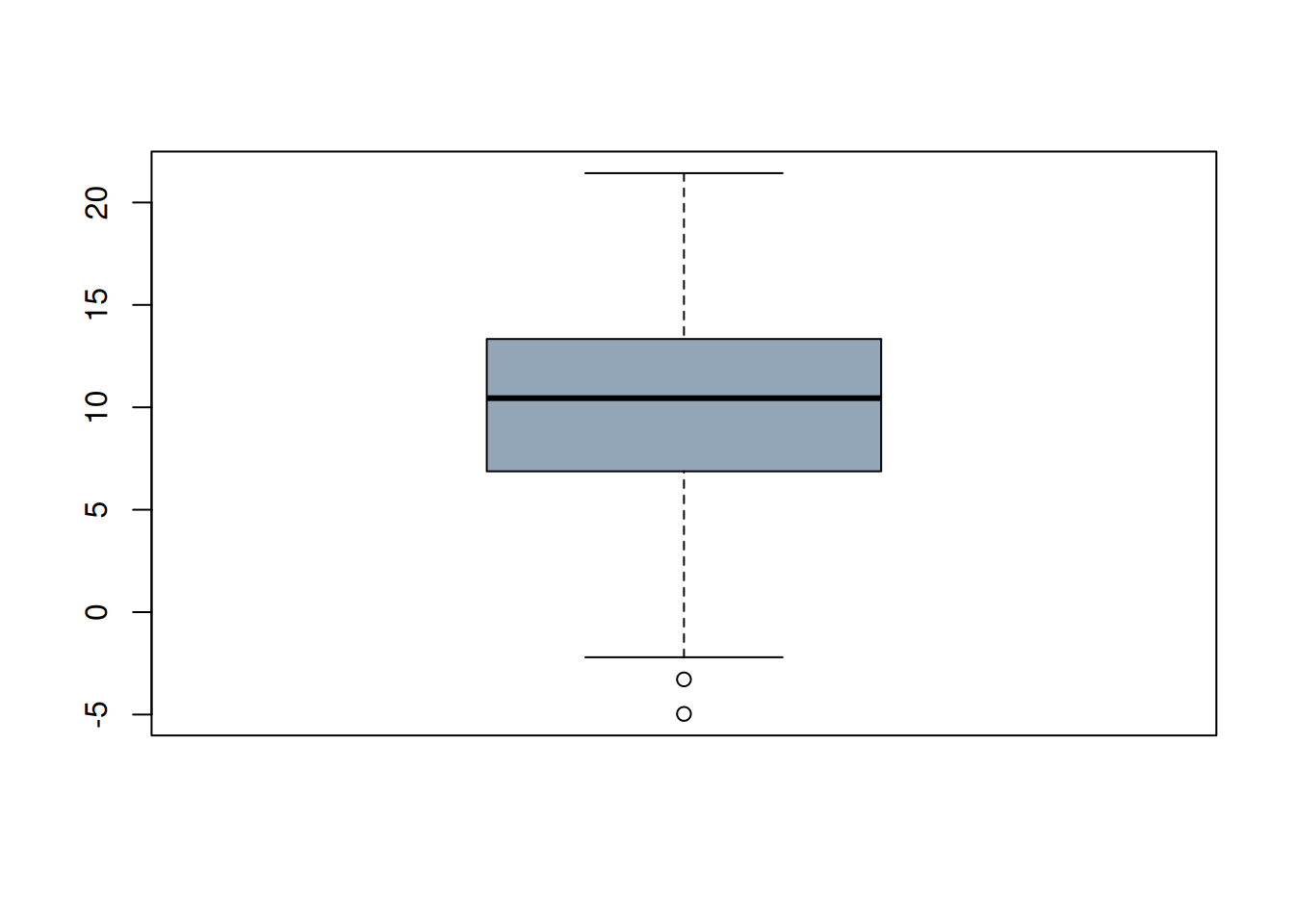
- Q. What does the boxplot show? In particular, how are the whiskers defined, and how are the points that are shown identified? Are these outliers?
If you are unsure, have a look at the boxplot() documentation for the details:
?boxplotIf you need some reminders on what terms like “median” and “quantile” mean, you can also check back to Section 4.2.
We also mentioned the “\(3\sigma\) rule”, do any of the values fall outside this range? How could you check this? Try this yourself before looking at the > Code!
Code
range(scale(v))- Q. Which outlier criterion is stricter: Tukey’s or the \(3\sigma\) rule?
We next look at at toy dataset of car fuel consumption, available via Brightspace: Week 4 / Datasets and R scripts for exercises / Errors and outliers / car_mpg.RData
Load the data using load():
print(load("car_mpg.RData")) [1] "car_mpg"- Q. Why did I wrap the
load()call withprint()?
Using the boxplot() function, produce boxplots of each of the 4 list elements of the car_mpg data. If you are unsure, use the code hidden below.
Code
par(mar = c(3,3,3,3), mfrow = c(2,2))
boxplot(mpg ~ car, data = car_mpg$data1,
        main = "N = 3")
boxplot(mpg ~ car, data = car_mpg$data2,
        main = "N = 3")
boxplot(mpg ~ car, data = car_mpg$data3,
        main = "N = 4")
boxplot(mpg ~ car, data = car_mpg$data4,
        main = "N = 5")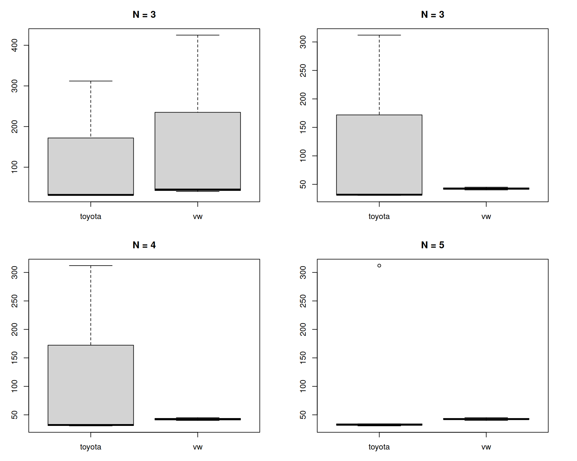
In these boxplots a main title was added with the number of observations underlying each box-and-whiskers plot. What do you notice about the data? Why are the bottom two plots so different?
Perhaps this is labouring the point here, but it is always useful to know what you are looking at with such visualisations!
Even in the top left-hand plot (N = 3), it should have been apparent that something was wrong when the median line was at the very bottom of the plot. Boxplots are often now accompanied by the (jittered) underlying datapoints, which would have highlighted the issue better:
boxplot(mpg ~ car, data = car_mpg$data1,
        main = "N = 3")
points(jitter(as.numeric(factor(car_mpg$data1$car)),
              amount = 0.02),
       car_mpg$data1$mpg)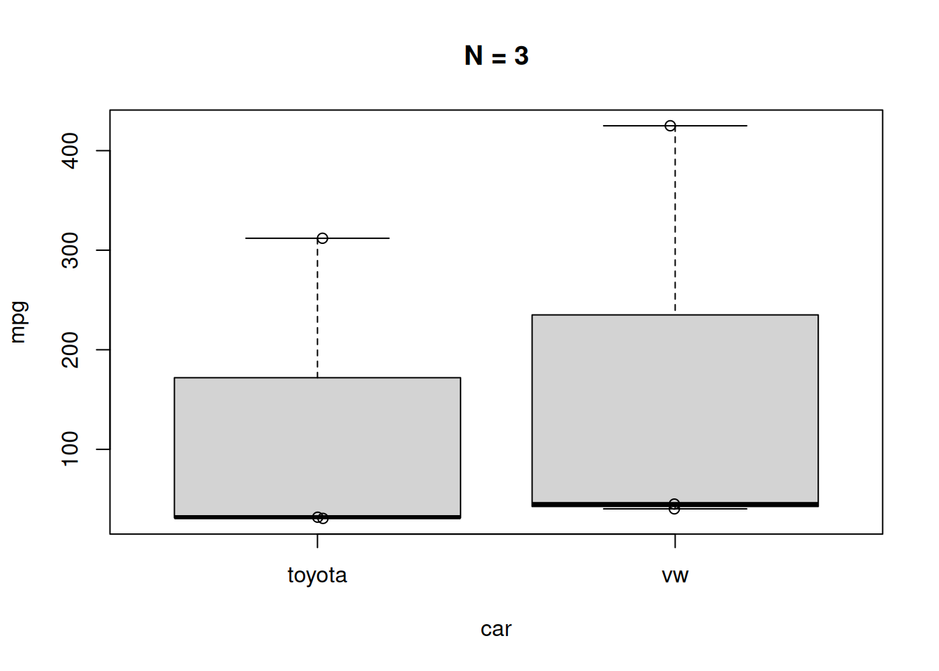
Final note
If you wanted to extract the “outliers” identified in a boxplot (data points beyond the whiskers), you can do this by first capturing the output of the function (it is silently returned by the function, probably using invisible()) and extracting relevant parts of the output:
bp <- boxplot(mpg ~ car, data = car_mpg$data4,
              plot = FALSE) #we don't want the plot again

setNames(bp$out,bp$names[bp$group]) #read the boxplot documentation!
toyota
312
TipExtra final note -
setNames()
setNames() is a useful little function to know, it sets the names of a vector:
vect <- setNames(1:5,letters[1:5])
vect
a b c d e
1 2 3 4 5 Residuals
As a last topic in this section, we will briefly consider how residuals can also tell us something about data quality and the potential presence of outliers. As you may recall, a residual is what is left over after fitting a model, which is often visualised for the case of a simple linear regression as follows:
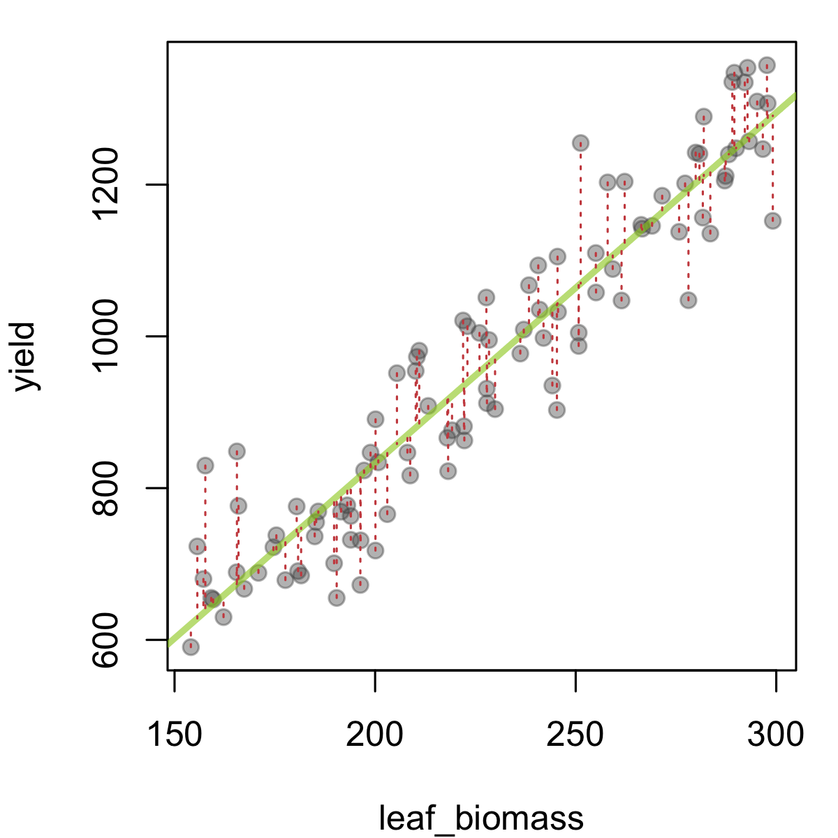
In this figure, leaf biomass is plotted against yield, and a fitted trendline (fitted using linear regression) has been added in green. The predicted yield given a leaf biomass value is the value the line takes at this point. So we can see the residual as the difference between the observed yield values, and those predicted by the model (in this case, a single line). These quantities are represented above as dashed red lines. Large deviations from the green line (= larger residuals) suggest that the particular observation in question is not in line (literally) with the trend from the rest of the data. This could be by chance, or due to a problematic data-point.
When fitting an ordinary linear model, one assumes certain things about the residuals (often shortened as i.i.d. - that they are independent of each other and identically distributed, namely that they are drawn from a \(N(0,\sigma_e^2)\) distribution - a Normal distribution with mean 0 and a shared variance). It is good practice to check the residuals (we often do this using residual plots) after running a regression or ANOVA model, to make sure the residuals are distributed as expected. These checks can also highlight potentially problematic data-points (with high residuals, or perhaps with high leverage i.e. having an unduly large influence on the model fit).
We will use a dataset of leaf biomass and yield collected from a field trial in potato (Solanum tuberosum) to demonstrate the point.
Exercise 11.2 (Potato yield (part 1))
Load the tab-delimited ‘potato_yield.dat’ dataset provided on Brightspace using the
read.table()function.Check the structure of the dataset using
str(). If there is an experimental factor that is coded as a character string, convert it to a factor (e.g. usingfactor()oras.factor()).Generate 2 boxplots, showing yield and leaf biomass, split across potato variety. Is there any evidence of outliers?
Create a scatter plot of the leaf biomass (x axis) versus yield (y axis) using
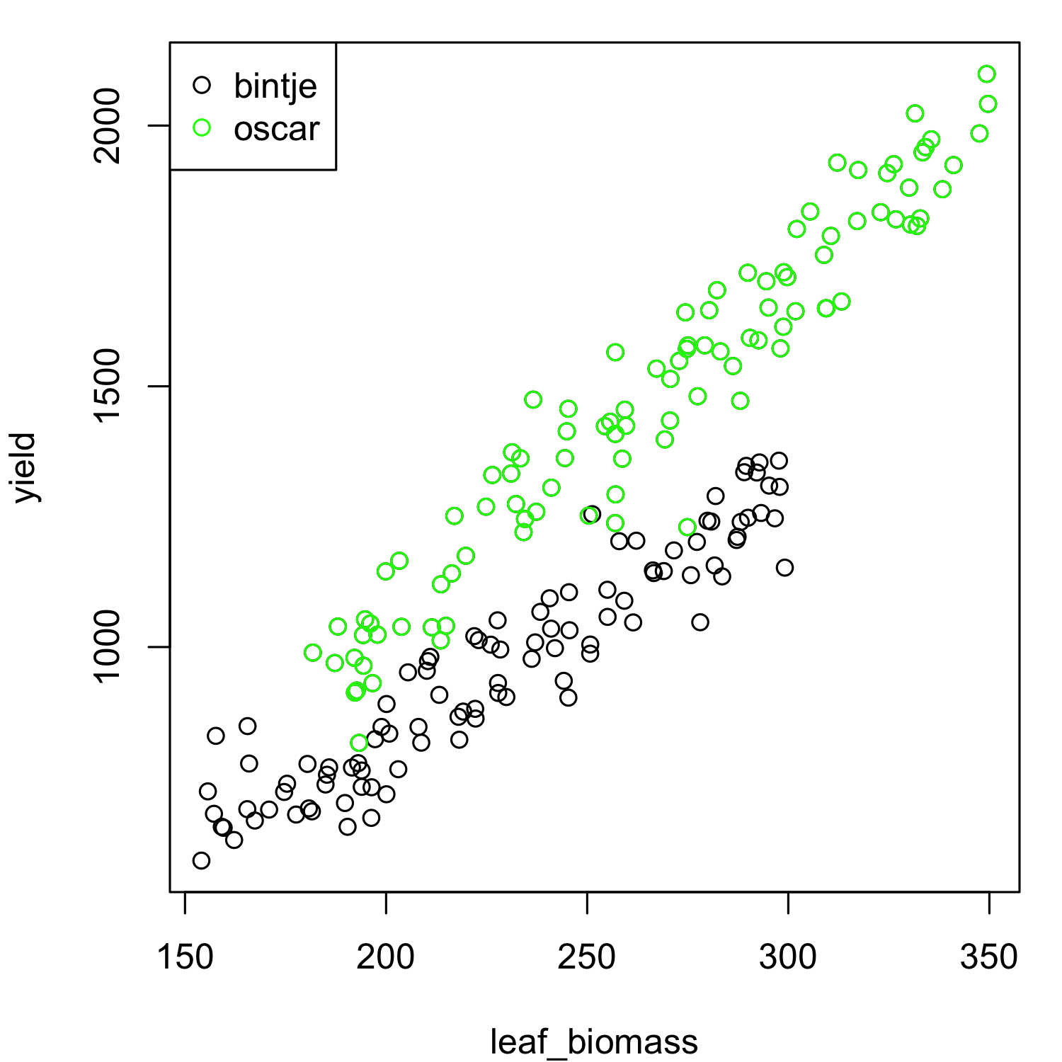
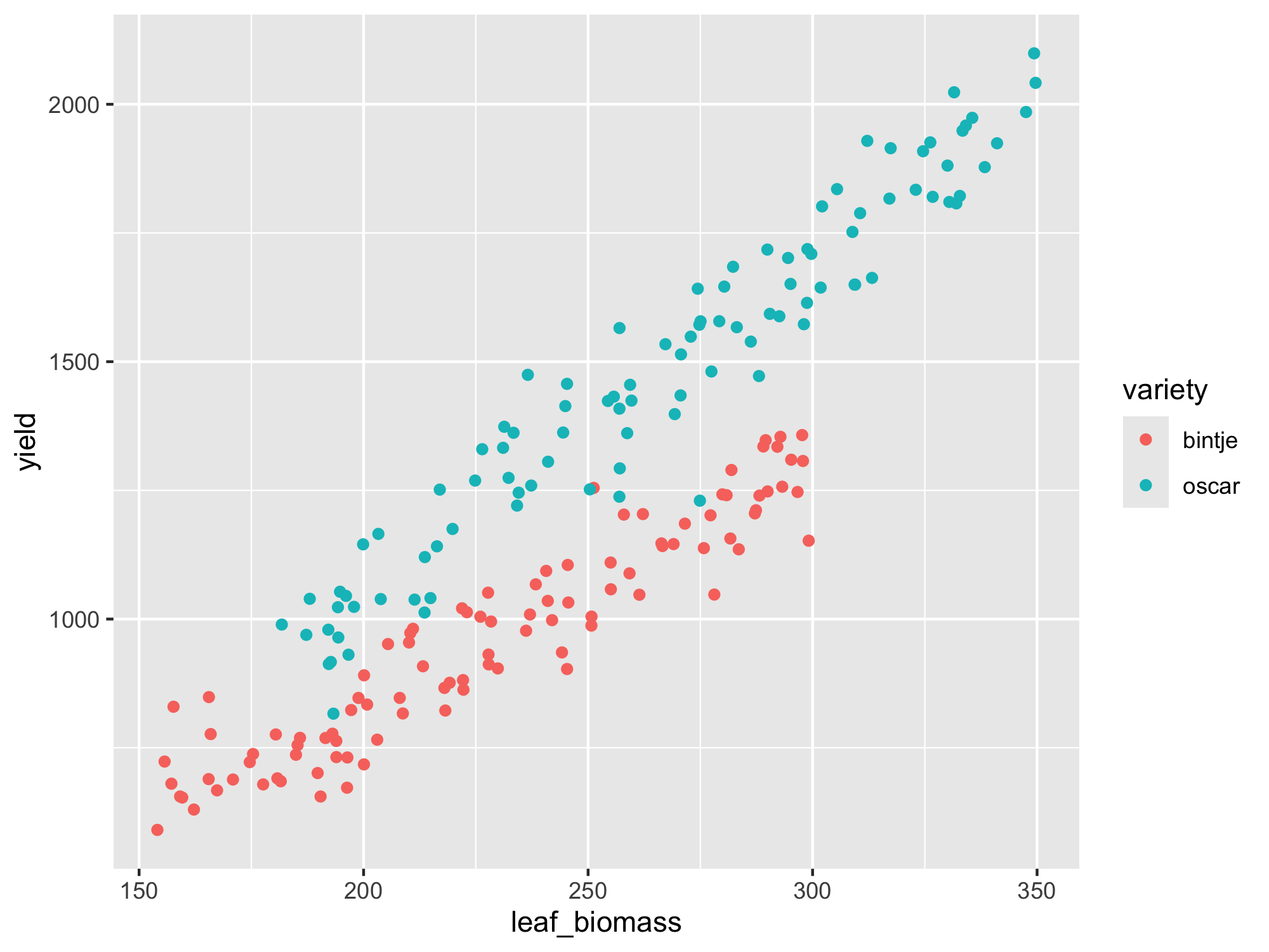
plot(). Can you spot any strange data points / potential outliers?Make the same plot, but now colour the points by potato variety. Can you spot any strange data points / potential outliers?
For the last of these exercises, you could either produce the plot using the base R plot() function, giving something like:
… or using ggplot2::ggplot():
If you were unable to complete the steps in the previous exercise after a reasonable attempt, please check Brightspace week 4 for a script file. If it is not yet visible, please raise your hand.
From the above scatter plots, it is not immediately obvious that there are any outlying data-points present. There also seems to be a clear linear relationship between leaf biomass and yield, so this data would appear to be suitable for linear regression. We can already observe that variety ‘Oscar’ produces more yield for the same leaf biomass as ‘Bintje’. We will fit a model with separate lines as we are not yet sure whether separate slopes or separate intercepts (or both) are needed. We can check this after fitting the model.
Our main interest for today is to check whether there are any outliers after model fitting, i.e. data points that lead to high residuals.
To run a linear model in R we will use the lm() function, followed by a visual check on the residuals.
Finally, we will check whether any of the Studentised residuals1 exceeds 3 (another rule of thumb for identifying potential outliers among the residuals).
The steps to do this in R are as follows:
set.seed(1221)

## Make a toy dataset with 2 factors a and b:
test_data <- data.frame(x = rep(1:10,2),
                        n = c(rep("a",10),rep("b",10)),
                        y = c(1:10 + rnorm(10,sd = 3),
                              seq(1,30,3) + rnorm(10,mean = 4,sd = 3))
)

test_data$n <- as.factor(test_data$n) #good habit to convert experimental factors to data type factor

## Run a linear model, allowing for separate fitted lines (allow interaction of n and x):
lm1 <- lm(y ~ n*x, data = test_data)

summary(lm1)
Call:
lm(formula = y ~ n * x, data = test_data)

Residuals:
    Min      1Q  Median      3Q     Max
-4.1848 -1.9225 -0.4774  1.6564  6.0345

Coefficients:
            Estimate Std. Error t value Pr(>|t|)
(Intercept)  -1.4113     1.9845  -0.711 0.487215
nb            3.2516     2.8065   1.159 0.263630
x             1.4520     0.3198   4.540 0.000335 ***
nb:x          1.5770     0.4523   3.486 0.003049 **
---
Signif. codes:  0 '***' 0.001 '**' 0.01 '*' 0.05 '.' 0.1 ' ' 1

Residual standard error: 2.905 on 16 degrees of freedom
Multiple R-squared:  0.924, Adjusted R-squared:  0.9098
F-statistic: 64.85 on 3 and 16 DF,  p-value: 3.584e-09
## ggplot2 offers useful functionality for plotting the regression lines:
library(ggplot2)
ggplot(data = test_data,
aes(x = x, y = y, color = n)) +
geom_point() +
geom_smooth(method = "lm", se = TRUE)`geom_smooth()` using formula = 'y ~ x'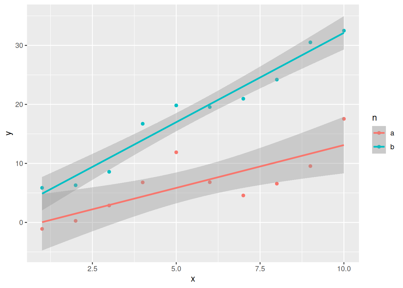
## Check the residual plots:
par(mfrow = c(1,2))
plot(lm1, which = c(1,2))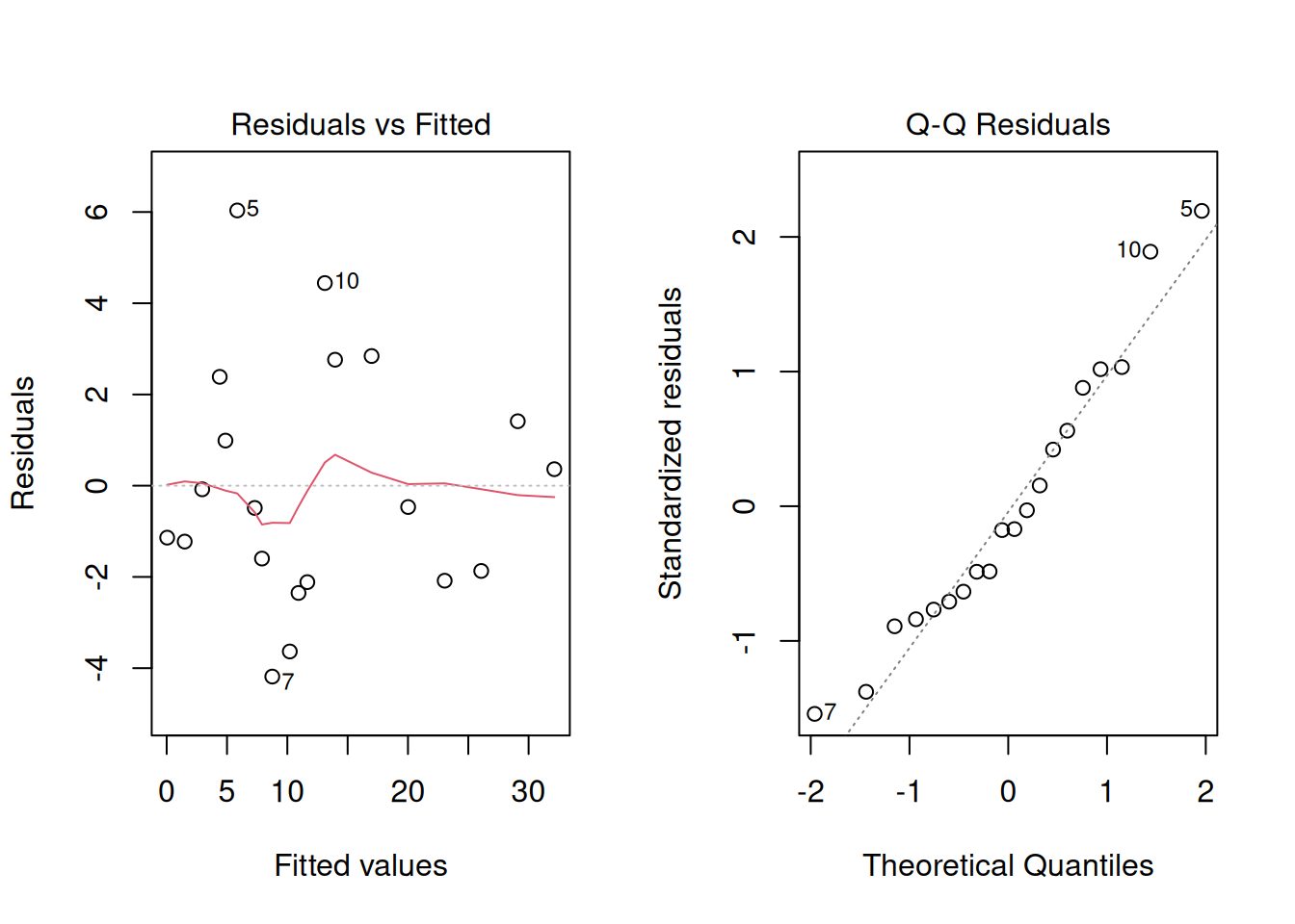
Exercise 11.3 (Potato yield (part 2))
Using a similar approach to the steps outlined above, run a linear model using the
lm()function for the potato yield dataset, withyieldas the response variable, allowing for separate fitted lines per variety.Check the residual plots. Are the model assumptions satisfied? Is there any evidence of high residuals?
Apply the rule of thumb on the Studentised residuals (Hint: use the
rstudent()function). Are any of the data points potential outliers using this criterion? Which one(s)?
11.3 Detecting errors in a simulated dataset
We are now going to move on to a “fun activity”, namely generating a simulated dataset with errors in it for somebody else to puzzle over.
The simulator is hosted on the shiny.wur.nl server.
The simulator uses Shiny, an R package for developing web applications with R (or Python) running under the hood. The simulation tool itself is quite basic: it allows the user to generate a dataset with user-defined numbers of genotypes & experimental blocks, various genetic, environmental and residual variances, for two measured traits (with the exciting names of ‘trait1’ and ‘trait2’). Finally, you can introduce outliers (generated according to the \(3\sigma\) rule) and missing values.
Running the simulation
The interface is in standard shiny layout, with a side panel for input and a main panel for output.
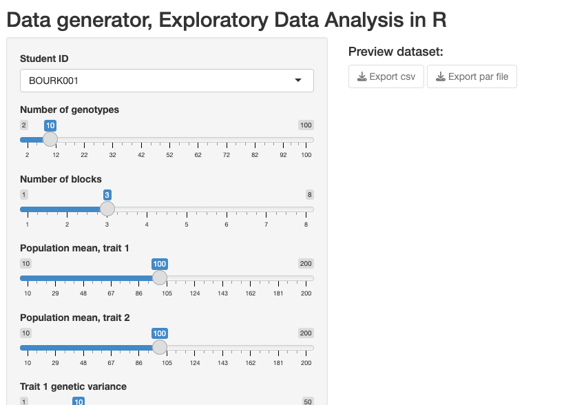
Step 1: Select your student ID in the drop-down menu
Step 2: Choose some interesting parameter settings using the input sliders.
Step 3: Click on the “Run Simulation” button.
Step 4: Export your data (both the CSV which has the simulated dataset, and a parameter file in .RDS format which contains a list of the “true” simulation settings that you chose). You need to click both download (Export) buttons shown:
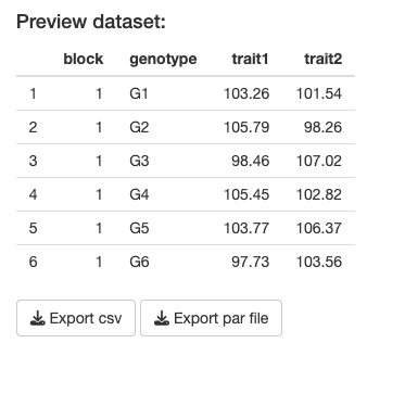
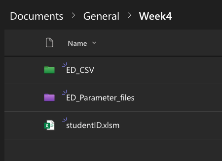
If all has gone well, there should be two data files present in your downloads folder.
These need to be uploaded on MS Teams to the appropriate folder (one for the CSV datafile and one for the parameter file):
As you may have noticed, the CSV filename has your student ID embedded - this is to help the detective find the correct file (a dataset is assigned based on student ID - this will be done in class). Student ID is then followed by a four-character code (a “filetag”), for example ‘AG27’. Note that the accompanying parameter file has a different filename, which is an encrypted version of the same four-character code. This is to avoid possible cheating (otherwise it would be very simple and perhaps tempting to look up the ‘true’ simulation parameters and correct your answers before submitting).
Analysing the data (Error Detective)
In class you will be randomly assigned another student’s simulated dataset to work with.
It is now time to become an Error Detective!
Download the CSV file assigned to you (you will need to look for this file via the studentID - make sure you analyse the correct file, and not your own one!).
On MS Teams there is a form that needs to be filled in (only visible during week 4 of the course):
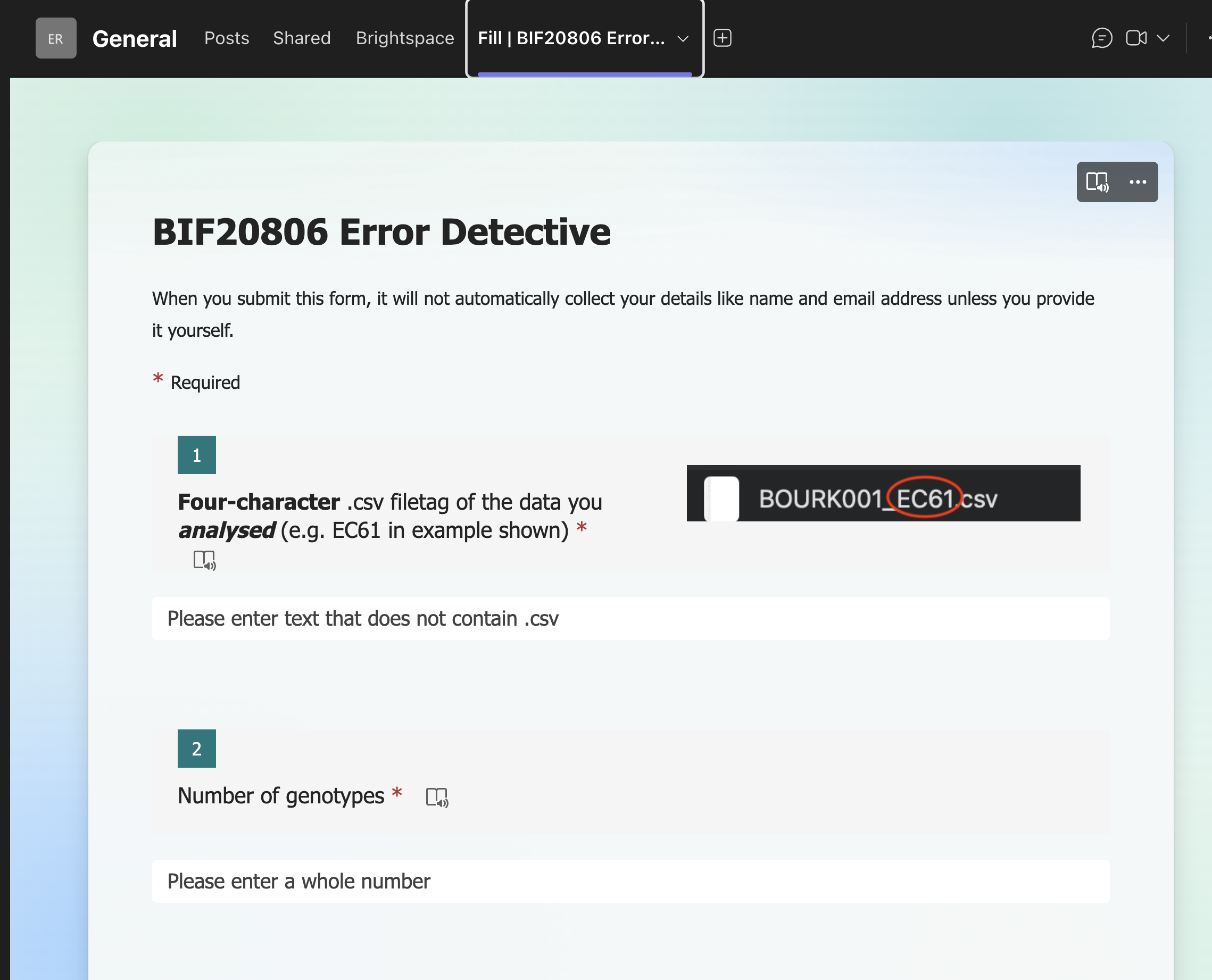
There are in total 10 questions to fill in:
| Question | Entry |
|---|---|
| 1 | Four_character_filetag |
| 2 | N_genotypes |
| 3 | N_blocks |
| 4 | mean_trait1 |
| 5 | mean_trait2 |
| 6 | rho |
| 7 | outlier_rate_trait1 |
| 8 | outlier_rate_trait2 |
| 9 | NA_rate_trait1 |
| 10 | NA_rate_trait2 |
The first of these is simply the four-character (filetag) of the file you analysed. Make sure you type this correctly! Typos here will mean your data will most likely be filtered out and not used in the plenary analysis.
The number of genotypes and blocks should be fairly straightforward to work out (have you already used the function unique()? If not, check it out!), as well as the mean trait values for trait1 and trait2 (the function mean() might help!).
Genetic correlation, \(\rho\)
The next item is more tricky - “rho”, the (Pearson) correlation co-efficient between the traits. Whoever generated the data you are now analysing selected a value for \(\rho\) between -1 and 1, but in the simulation app, this was actually the genetic correlation between traits, not the correlation between the phenotypes directly.
In many instances we are more interested in the genetic rather than the phenotypic correlation, as phenotypes are often affected by other effects, e.g. block effects, other environmental effects, experimental treatments etc. The usual way to estimate the genetic correlation is to fit a multivariate model with an explicit variance-covariance structure. If genome-wide marker information is available, this can also be used to get a better estimation of the genetic correlation, taking into account different levels of genetic relatedness between individuals.
Here we will keep it very simple - we will estimate \(\rho\) by calculating the correlation between the estimated genetic effects themselves (the “predicted values” from the fitted model of the genotypes). Once you have done that, check for yourself how \(\rho\) compares to the correlation between the raw phenotypes (i.e. cor(data$trait1,data$trait2)). The correlation should be broadly similar but probably not identical (unless the block variance was 0 and there was no noise in the data!).
You are not expected to be able to write a function to do this yourself - you may use the estimate_rho() function given here:
estimate_rho <- function(data){
  ## Start-up checks -- -- -- -- -- -- -- -- --
  if(!"data.frame" %in% class(data)){
    warning("input data is not a data frame. Trying to convert..")
    data <- as.data.frame(data) #try to coerce to a data frame
  }

  if(!all(c("block","genotype","trait1","trait2") %in% colnames(data))){
    stop("Expected colnames 'block', 'genotype', 'trait1' and 'trait2'.\nPlease check the input")
  }
  ## End of start-up checks -- -- -- -- -- -- -- -- --

  ## Convert factors to factors:
  data$block <- as.factor(data$block) #this is important - block is not numeric!
  data$genotype <- as.factor(data$genotype) #this is just for good habit forming

  ## Fit linear model (no interaction):
  lm1 <- lm(trait1 ~ block + genotype, data = data)
  lm2 <- lm(trait2 ~ block + genotype, data = data)

  ## Extract the fitted coefficients (intercept and slopes)
  coef1 <- lm1$coefficients
  coef2 <- lm2$coefficients

  ## Append 0 for the first genotype; the rest are contrasts:
  fixef1 <- c(0,coef1[grep("genotype",names(coef1))])
  fixef2 <- c(0,coef2[grep("genotype",names(coef2))])

  return(cor(fixef1,fixef2))
}
Note that in the exam you will be expected to be able to write a simple function, including the correct use of input arguments in round brackets, function body in curly brackets, return at the end etc.
The last four items for the Error Detective are also relatively straightforward - for example you can identify NA values with the is.na() function. But you may want to give some thought to how to identify outliers. Should you use a boxplot, the \(3\sigma\) rule, or via the residuals? Maybe try all these approaches and make an informed decision before submitting the form. When all students have submitted their Detective forms, we will collectively analyse the results, to see how well (or poorly) you were able to describe the attributes of the datasets. Afterwards, you can delve more into the group data to see whether you can identify factors that affected prediction accuracy.
Exercise 11.4 (Final exercise) We have put the focus here on identifying errors in the dataset. As an additional exercise, see whether any of your data parameter estimates change if you “clean up” the dataset before estimating them.
Studentised residuals are a type of scaled residual (mean 0 and standard deviation 1). The difference between a Studentised and a simply scaled residual is that for Studentised residuals, the scaling division uses an estimate of the standard deviation excluding the data point itself. This is especially useful when trying to identify outliers, as large outliers can lead to an inflated estimate of the standard deviation, which will tend to shrink all residuals when scaling.↩︎