Throughout the book you have encountered packages from the tidyverse: one of the first things you did in Section 1.1 was importing the tidyverse package. In this chapter we dive into more detail about what the tidyverse actually is, how it relates to important data analysis concepts, and how it differs from some base R concepts.
The main reasons we dedicate a chapter to this are: 1. The tidyverse is used a lot: it will show up in many published data analysis approaches. 2. The approaches in the tidyverse are quite different from what you see when using base R: especially the use of the pipe operator deserves some attention.
Figure 7.1: The tidyverse is a universe of R packages for working with tidy data
7.1 What is the tidyverse?
In essence, the tidyverse is not just a package, it is a collection of packages. The main application of the tidyverse is working with tidy data: any data that can naturally be represented in tables where columns are variables and rows are observations. Coincidentally, many data science and statistics approaches work with such tabular data, making the tidyverse a natural fit. An example of a very common problem that is elegantly solved in the tidyverse is going back and forth between long and wide representations of tabular data (Note 7.1).
Note 7.1: Long VS wide tables
The tidyverse is designed to work with tables where rows are observations and columns are variables. However, some of the language features of the tidyverse are difficult to implement when the columns of a table represent the actual variables 1. A common solution in the tidyverse is to introduce two abstract columns: a name and a value column, and to map the original variable names to the name column and the variable value to the value column. A table with the actual variables as columns is called a wide table, a table with abstract columns name and value is called a long table. A straightforward example can be a series of height measurement of various plants:
Wide format table of a time-series plant growth experiment
plant_id
day_0
day_1
day_3
day_7
1
1
2
5.5
7
2
1.2
1.3
4
8
Long format table of the same time-series plant growth experiment
plant_id
name
value
1
“day0”
1
1
“day1”
2
1
“day3”
5.5
1
“day7”
7
2
“day0”
1.2
2
“day1”
1.3
2
“day3”
4
2
“day7”
8
Wide tables are more readable for humans, long tables are more easy to perform computations on. Crucially, the information contained in a long or wide table is identical. The tidyverse implements very clean logic to alternate between these two representations with pivot_wider() and pivot_longer().
The overarching design principle can be described as making data analysis code readable for humans. To achieve this, several packages implement very specific language features that bring the R language closer to the English language 2. In the following sections, we outline how dplyr, tidyr, and ggplot2 implement their own specific language features.
7.2 Dplyr and tidyr
Within the tidyverse, dplyr and tidyr implement most tidy language features for transforming tabular data. Although they are distributed as separate packages, they are best understood as two parts of a single language for describing how a table should change.
The difference between them is not the type of data they work on, but the aspect of the table they modify:
dplyr transforms the contents of a table (rows and columns)
tidyr transforms the structure of a table (long to wide and vice-versa)
Both rely on a small set of verbs (implemented as functions) that describe common data manipulation tasks, such as selecting rows (filter()) or columns (select()), creating or transforming variables (mutate()), computing summaries (summarise()), or reshaping data (arrange(),group_by()). More complex operations are expressed by combining these verbs.
These verbs are typically connected using the pipe operator |>3, which passes the result of one step directly to the next (thus creating a pipe-line). The trick here is that by using the pipe operator, you automatically inject the output of the first function into the first argument of the second function. Most tidyverse functions are designed to take a tibble or dataframe as first argument, and also return a tibble, making it straightforward to chain operations. This allows data manipulation code to be written as a sequence of transformations, read from top to bottom.
While dplyr keeps the overall table structure intact, tidyr is used when the structure itself gets in the way of analysis. In particular, it provides tools to convert between wide and long tables by making information encoded in column names explicit.
In practice, dplyr and tidyr are almost always used together. From the user’s perspective, they form a single, coherent language for data transformation, well suited for exploratory data analysis.
Tip 7.1: Comparing dplyr with base R
Any operation that can be performed with the tidyverse can in principle also be performed with base R. The tidyverse should mostly result in code that is more natural to read for humans, making it easier to follow which steps are being taken. The following examples compute the exact same summaries, once in base R, and twice using dplyr verbs (once with and once without the pipe operator).
Base R
# Base R code to compute mean leaf tissue density for annuals and perennials seperately# 1. Remove rows with any NAdat <- grassland_traits_environment[complete.cases(grassland_traits_environment), ]# 2. Split data by life_historysplit_dat <-split(dat, dat$life_history)# 3. Compute mean ld per groupresult <-data.frame(life_history =names(split_dat),mean_ld =sapply(split_dat, function(x) mean(x$ld)))result
# dplyr code to compute mean leaf tissue density for annuals and perennials seperatelylibrary(tidyverse)grassland_traits_environment |># Datasetdrop_na() |># Remove rows with NAsgroup_by(life_history) |># Group by life historysummarise(mean_ld =mean(ld)) # Compute mean ld per group
# dplyr code to compute mean leaf tissue density for annuals and perennials seperately# Key difference with previous example: no pipe operators used!library(tidyverse)summarise(group_by(drop_na(grassland_traits_environment), life_history), mean_ld=mean(ld))
Exercise 7.1 (Compare dplyr and base R results) In Tip 7.1 there are three examples of the same analysis, one in base R and two using dplyr. You’ll notice the numbers are the same, but that one returns a regular dataframe and the others return a ‘tibble’ (if you want you can verify this by copying and pasting the corresponding code). Tibbles are also part of the tidyverse, take a look at the tibble homepage and describe the main differences with regular dataframes.
Which dplyr version of the code do you prefer and why?
7.3 GGplot2
Just like dplyr and tidyr introduce specific language elements for transforming data, ggplot introduces specific language elements for creating data visualizations. More specifically, it uses a hierarchical Grammar of Graphics4.
A data visualization according to the grammar of graphics in ggplot2 is built up around the following elements:
Defaults: used for all other layers unless otherwise specified
Dataset (typically a dataframe)
Aesthetic mappings (e.g. what goes on the x and y axes, colors, fills, etc.)
Layers:
Geometric objects (e.g. a point, line, box, ribbon, etc.)
Statistical transformation
Position adjustment
Scales: mapping of data to aesthetic attributes (e.g. choosing specific palettes)
Coordinates: mapping of data to the plane of the plot (mostly x,y but could also be e.g. polar coordinates)
Facets: split up the data
Themes: style choices for e.g. background colors, line widths, etc.
The different elements of a ggplot2 visualization are implemented in corresponding functions: the ggplot() function takes care of the defaults, the other elements often have prefixed functions indicating there role: geom_*(), facet_*(), coord_*(), or theme_*().
Unlike dplyr and tidyr, ggplot2 elements are not combined with the pipe operator. This follows the convention of making tidyverse language match natural language: different elements are added to the plot, so ggplot2 elements are combined with the + operator. Furthermore, where there are often one-to-one base R implementations of dplyr and tidyr pipelines, the same is not true for ggplot2: base R hase good default plotting functions, but ggplot2 offers clear improvements in capability and flexibility.
Exercise 7.2 (Revisit tidyverse code from week 1) In Exercise 1.12 you were presented with code that made extensive use of the tidyverse. Look at this code again, and see whether you can identify the different tidyverse concepts that have been introduced in this chapter. Next, we are going to modify the code from the earlier assignment, so that we can create a single ggplot2 plot of a few of the accessions.
Using tidyverse concepts, do the following:
Load the day1 dataset (BIF20806_Warmerdam_dataset.txt), you can find this on the week1 BrightSpace
Select only the following plant genotypes: ‘Col-0’,‘Bay-0’,‘Ler-1’,‘Hey-1’. Hint: you can use the filter() function and make use of the %in% operator.
Make a ggplot2 boxplot with the datapoints added as points, put the plant genotype on the X-axis and use the plant genotype for color.
Which genotype has the highest eggmass? Which has the most observations? What would you do if you wanted to plot a few other genotypes (Hint: Section 4.1)?
Next, add the following to your ggplot: facet_wrap(~screening).
How does the plot change? What additional difference between plant genotypes do you notice? What does the ~ in facet_wrap() do?
7.4 Assignment for code review week 2
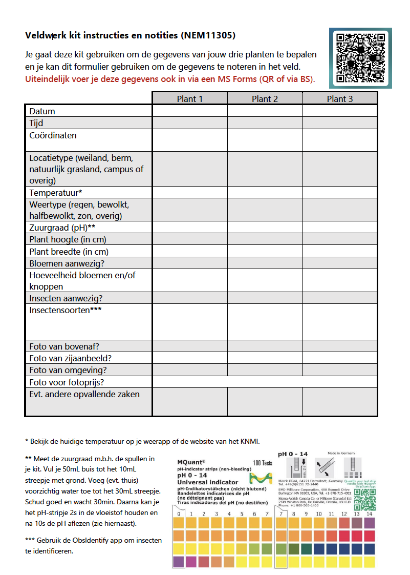
In the course Plant Science in Practice (NEM11305) you previously worked on collecting your own plant trait and environmental data. Specifically, you collected field observations for Jacobaea vulgaris, and recorded your observations using a form with standardized questions (Figure 7.2). For this assignment, you will (re-)analyse the data that you (and your fellow students) gathered yourself.
Figure 7.2: Instructions for gathering field observations used in the course Plant Science in Practice (NEM11305). The standardized form should make downstream analysis more straightforward.
The dataset for this assignment is available on BrightSpace (Content –> Week 2 –> Assignment –> NEM11305 Dataset).
Exercise 7.3 (Analyse student-collected plant trait and environment data) For this assignment you will hand in a quarto notebook (.qmd file) that contains your code and interpretation. The work you hand in should contain the following:
Code for the following operations:
Installing and loading the relevant packages
Loading the dataset
Creating a summary of the dataset
A correlation analysis of stem length and plant width (‘Stengellengte’ and ‘Plantbreedte’ in the dataset)
A boxplot visualizing the distribution of soil acidity (‘Zuurgraad’) across different soil types (‘Bodemtype’)
Text with the following interpretations/explanations:
A brief description of what the dataset looks like: size, variables, summary statistics
Interpretations for the correlation analysis and visualization
Make use of the quarto markdown elements to structure your work in a readable fashion.
This happens when e.g. variables are compared, or used for subsetting: in both cases variables are treated as data, which is easier when they are actually in the table↩︎
A (part of a) programming language that is aimed at a very specific case is often referred to as a Domain Specific Language↩︎
Modern R versions include the pipe operator as part of the default language. In older versions of R you might see %>% being used, which does mostly the same thing but was introduced by the magritrr package↩︎
Indeed, the GG in GGplot stands for Grammar of Graphics↩︎