    # Set a work directory
    ?setwd()

###Now type the function to set a location on your HDD to work from1 The importance of data analysis
1.1 The importance of data analysis
Introduction to day 1
Today we will focus on goal 1 (Built basic knowledge on using R and R studio) and goal 5 [Apply the data-science cycle (load, inspect, clean, analyse, present)].
In order to illustrate some concepts, we will make use of data from a paper on nematode infections in Arabidopsis thaliana1.
TipM. incognita infections in A. thaliana
Plant susceptibility to nematodes is a complex trait, with a lot of variation in susceptibility between individuals of the same species. At the Laboratory of Nematology, we study this plant-property. The study by Sonja Warmerdam (who, before her PhD, studied plant science)1 was conducted on 340 ecotypes of the model plant A. thaliana. These were infected with the tropical root knot nematode Meloidogyne incognita. This plant-parasitic nematode is the cause of a major agricultural burden globally2. We will use data from the initial screening (that took over 1.5 years) that was conducted for this research project.
As you gathered by now, this is a course in which we will use the versatile, statistical programming language R. We will teach you how to use R via RStudio. In particular we will teach you how to write and document code for data analysis. By the end of this week, you will have made your first steps towards making documents as you are reading now: Quarto markdown.
Set up your R environment
In this section of the book, the basics of setting up RStudio are explained. You are welcome to revisit this section any day of the course.
NoteA short intro to RStudio and scripts
When you open RStudio, you see four panes.
Now, check the message you see in the console.The R version displayed is important.
Exercise 1.1 (Getting to grips with R) Start RStudio and browse through to find out: 1. Which version of R are you running? 2. Where can you find which packages are activated? 3. Which version of the stats package is active? 4. Where on your Harddrive is the current (default) working directory?
The scripts you are using the first week should work with R versions 4.3 and onwards. If your version number is lower, please first shut-down RStudio and install a newer version of R. You can find out how to do so here. RStudio should automatically pick up on the newer installed version. You can check if this worked by checking the version number of R after installation.
It is generally advisable to install a new version of R at the start of a new project (e.g. BSc thesis).
Documenting your code
Your analysis starts with making a file to document your progress and thereafter you follow the standard steps in data analysis
- Loading
- Inspecting
- Cleaning
- Analyzing
- Presenting
For the tutorials, assignments, and exams, it’s important that you built a file documenting your code. On the first two days, we will provide a full-scale template for you, that you can find here. This Quarto markdown template you can open into the text editor in R-studio.
Exercise 1.2 (Prepare your documentation) Open the Quarto markdown template in RStudio and fill in your own information.
This type of document is also what you will make for the assignments. Furthermore, you will also make your exam based on this template.
Telling R where on the hard drive it should work from.
First, you need to set a work directory (tell R where on the hard drive you’ll be working from). This can be done with the function setwd(), where you have to fill in the work directory yourself. If you want to know how to use that function type ?setwd() into the console.
Exercise 1.3 (Set your work directory) Run the script below to get information on the setwd() function. thereafeter, use it to set the location where R should work from. It is advisable to make a folder on your HDD for items related to this course.
Alternatively, you can also use the three dots ... in the top-right corner of the files pane of RStudio to navigate towards the location you will be working from.
Installing packages.
Typically R-users use several ‘packages’. These packages, give extra functionality to R. The main repositories are:
In this tutorial we will be making use of various packages. During week 1 we will make use of the {readxl} and {tidyverse} package each day, including during the exam. By the end of this first week, we expect you are able to install and activate packages.
Exercise 1.4 (Install packages) Install the {readxl} and {tidyverse} packages.
    # Install the package
    install.packages("readxl")    # For reading Excel files
    install.packages("tidyverse") # For wrangling data and generating plots
Note that you only need to install a package once, and only re-install it if the package has a new version or you install a new version of R.
Exercise 1.5 (Activate packages) To activate the package, we need to load it into memory:
    # Activate the package
    library("readxl")
    library("tidyverse")
Now you are all set to do data-analysis in R!
1.2 Analysis of quantitative phenotypic data from an experiment
Loading data into R
During this course, we will load different types of data files into R. This is an essential skill for working with real-world data. In the following days we’ll cover a couple of file-types that are common, especially tomorrow, (Chapter 2 we will cover file-types.
For today, we have provided you with data in tab-delimited text format. Download the data via fileshare link on Brightspace and save it in your course folder.
Load this data using the function read.delim(). You see the arrow <-, this indicates that an object is defined within the R environment that will hold the loaded data. In general, you can find information about basic operators in the appendices (base-r-cheatsheet). For the remainder of this chapter, we will continue working on this object pheno_data.
    # Maybe you need to add the path to your tab-delimited file
    pheno_data <- read.delim("./BIF20806_Warmerdam_dataset.txt")
Inspecting data
It is always important to check your data, this can be done using specific functions or via plots. Always check what you did; when you load in data, check if it conforms to what you expect.
Using functions
There are a couple of handy functions you should use to check the data you loaded: head(), tail(), and summarise().
    # Check the first 6 rows
    head(pheno_data)

    # Check the last 6 rows
    tail(pheno_data)

    # get a summary of the data (per column)
    summary(pheno_data)
As you see above, these functions give a good overview of the dataset. It is important to do these basic checks in order to confirm that your data is in the right shape.
You can also specifically check items in an object by using [], also see (base-r-cheatsheet).
    # The 18th row
    pheno_data[18,]

    # The 3rd column
    pheno_data[,3]

    # Or combined the 18th row of the 3rd column
    pheno_data[18,3]

    # the 18th value of the Line column; as a vector is one-dimensional only 1 coordinate is needed.
    pheno_data$Line[18]
Inspect and clean data using ggplot2 and tidyverse
To actually clean data, you need to inspect it (take a peak). I typically make a couple of plots. For example, here using ggplot (comes with the tidyverse package). You can read more about the plotting functions on their website
The code below produces a boxplot, great for checking continuous data. A box-plot displays various summary statistics of the data (more on that next week in Chapter 4).
NoteBoxplot
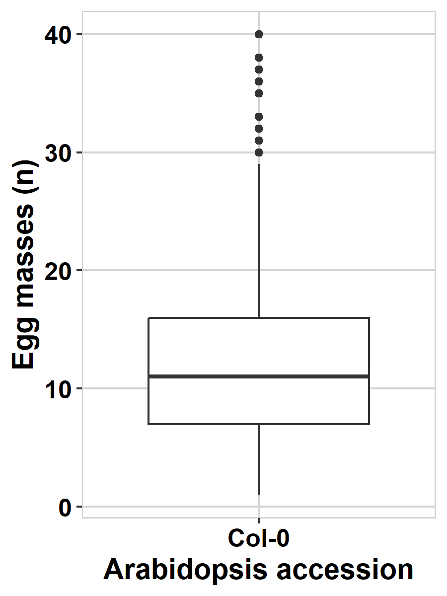 The thick line in the middle of the box represents the median of the data (the value of the number in the middle when all values are placed in order), the outer lines of the box represent the 25% and 75% quantiles (the values of the numbers at 25 and 75 percent of all values). The lines sticking out of the box (‘whiskers’) represent the values covering ~95% of the data. If you see dots beyond these whiskers, these represent extreme values within the dataset.
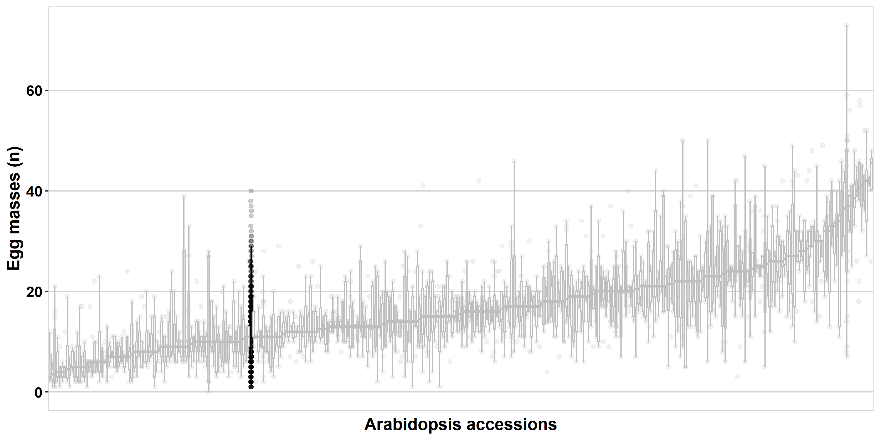
Now produce the boxplot of all data from the paper1.
    data.plot <- pheno_data

    ggplot2::ggplot(data.plot,aes(x=genotype,y=eggmass)) +
    geom_boxplot()
I notice in the plot that there are a couple of single points (the horizontal stripes) per strain, also, there seem to be a couple of really high values. Let’s check these.
Now, let’s have a look at the distribution of the data.
Exercise 1.6 (Histogram) Try to plot a histogram, for that you need to adjust the boxplot code above a bit. You need to use the geom_histogram() function. Use the ggplot2 website to figure out how to make this plot.
    data.plot <- pheno_data

    ggplot2::ggplot(data.plot) + aes() + ###select the right set of values to make the plot (hint: you only need the quantitative data)
    geom_ ###add the right geom
Use table to inspect observation per genotype
For the single values per genotype, it can be handy to use the table() function. Try to use this function on the column genotype. You can use pheno_data$genotype to access that column.
    ### this way you can figure out how the function works
    ?table()

    table(pheno_data$genotype)
This way, you can check the number of observations per genotype.
Exercise 1.7 (Make a table) Now use table() to check the Line names. For this you need to indicate the column that is accessed
Code
table(pheno_data) ### you need to indicate the column you accessCleaning and preparing the data
In this example, all data is clean and we will not spend time cleaning it up. But it is important to realize that there typically are errors and inconsistencies in datasets. Figuring these out and fixing them is a large chunk of doing data analysis.
Analyzing
Normal distribution
Let’s figure out whether the data is normally distributed. This is important for determining which kinds of statistical tests can be used.
For this we can use the functions stat_qq() and stat_qq_line().
    data.plot <- pheno_data

    ggplot(pheno_data,aes(sample=eggmass)) +
    stat_qq() + stat_qq_line()
Alternatively, you can use a Shapiro-Wilk test (shapiro.test), this tests the deviation from normality.
    data.test <- pheno_data

    shapiro.test(data.test$eggmass)
Exercise 1.8 (Does the data follow a normal distribution?) You now conducted two types of analyses that tell you whether the data is normally distributed. (1) what do you see in the qqplot, and what does it mean? (2) what is the p-value from the Shapiro-Wilk test? (3) what does a p-value mean?
T-test
Now we can use a t-test to compare between two samples. For that, we first need to generate a smaller set of genotypes. We want to test a genotype versus the A. thaliana reference genotype Col-0. Let’s take the also popular Cvi-0 genotype to compare.
NoteUsing a tidyverse pipeline
In the lines below, we first group (dplyr::group()) the batches together (screenings were done at a particular date), then we keep only the screenings with Col-0 and Cvi-0 in them (dplyr::filter()). Thereafter we remove the grouping (dplyr::ungroup()) and keep only the Col-0 and Cvi-0 observations (again with dplyr::filter()).
You may notice that at the end of these lines you find the %>% operator. This operator moves the output of the pervious line into the function on the next line. The code you see below follows a manner of programming that distinct from programming in base-R. Namely, it uses the {tidyverse} packages. More information about this will follow later (and see appendix on tidyverse).
    data.test <- dplyr::group_by(pheno_data,screening) %>%
                 dplyr::filter(("Col-0" %in% Line & "Cvi-0" %in% Line)) %>%
                 dplyr::ungroup() %>%
                 dplyr::filter(Line %in% c("Col-0","Cvi-0"))
Now the data is filtered, we can test. See if you can test whether these two A. thaliana genotypes are different in their susceptiblity to Meloidogyne incognita. Use t.test()
t.test(eggmass~Line,data=data.test)
###you should have p-value = 2.588e-06
Exercise 1.9 (How to interpret a p-value?) You now have tested a null-hypothesis and found that the chance his data agrees with this null-hypothesis is very small. What is the biological interpretation of this p-value?
Presenting
Can you now also make a plot of what you just tested?
Boxplot
Use geom_boxplot() to visualize the distribution and geom_jitter() to show the individual measurements.
    ggplot(data.test,aes(x=Line,y=eggmass)) +
    geom_boxplot() + geom_jitter(height=0,width=0.25)
We can make it a bit fancier by plotting the p-value as well. Try to include it into the plot by using the function annotate(). We use broom::tidy() for convenience, {broom} is also included in the {tidyverse}.
To make the fancy plot, we add statistics with ggplot2::annotate(). Also, we’ve added a layout with theme_bw() and axis labels with ggplot2::labs(). The function expression() allows printing of cursive text and super and sub script within {ggplot2} axis labels.
    ### Fancier boxplot
        ###I'm getting the statistics here
        statplot <- broom::tidy(t.test(eggmass~Line,data=data.test))

        p1 <- ggplot(data.test,aes(x=Line, y=eggmass)) +
              geom_boxplot() +
              geom_jitter(height=0, width=0.25) +
              theme_bw() +
              annotate("text", x=1.5, y=max(data.test$eggmass),
                       label=paste("p =", signif(statplot$p.value, 2))) +
              labs(x=expression(bolditalic("A. thaliana")~bold("genotype")),
                   y=expression(bolditalic("M. incognita")~bold("eggmasses (n)")))

        p1
Saving plots
Now you have your plot, you need to save it. If you render it within the notebook you are keeping, the plot will be shown when you hit ‘render’ (you need pandoc installed to be able to do this).
Most of the time, you will make a figure that you can share later.There are multiple ‘graphical devices’ in R that you can use to plot.
The function I use most often is pdf(). The reason is that this function produces vectorized pdf’s, which means that figures have infinite resolution. When you want to save your plot using this function, either save the figure in a file (as in the previous section), or plot directly within the ‘graphical device’, if you use {ggplot2}, you often have to explicitly define that you print the plot, by adding the function print(). Your entire plotting code than should be included in the brackets.
I also need to define how wide and high I want to make the plot (in inches). I play around with the dimensions a lot, to get the figure in the right proportions. Note that the plotting is ended with dev.off(). This shuts down the graphical device. If you do not do that, it remains open and you will not see any plots appear on your plotting window in RStudio.
Exercise 1.10 (Save the plot) Now save the plot running the code below.
    pdf(file="Figure_Col0-Cvi0.pdf", width=3, height=4)
        print(p1)
    dev.off()
Confirm that you now have a file on your HDD, within the folder you set as your working directory.
A for-loop
NoteThe basics of a loop
Within the data there are 332 unique genotypes. Verify this using the function unique() to get the unique genotypes and length() to count.
genotypes <- unique(pheno_data$Line)

length(genotypes)
What if we want to plot all of these versus Col-0? Writing all these plots line-by-line is not doable. For this we can use a for-loop. with the function for() you can start a loop. The for() function counts along a variable. There are also other loops possible, for instance with while() that continues if a condition is met. Let’s first look at a simple for-loop.
for(i in 1:30){
    cat("",i)
}
That probably went too fast, but it printed the values 1:30 in your console. You can loop over any vector:
for(i in c("N. americanus","E. vermicularis","M. incognita","A. suum",
           "T. semipenetrans","O. volvulvus","D. dipsaci","E. arcuatus")){
    print(i)
}
A ‘cleaner’ way to write this (at least in our opinion) is to loop over the index number in the vector with species names 1:8 and then select the species for printing.
species <- c("N. americanus","E. vermicularis","M. incognita","A. suum",
           "T. semipenetrans","O. volvulvus","D. dipsaci","E. arcuatus")

for(i in 1:length(species)){
    print(species[i])
}
Use this to test any A. thaliana genotype against Col-0.
For-loop over t-tests
Let’s automatize the t-test function! This is a bit simpler than plotting. For this, you need to make a for-loop cycling over the genoypes in pheno_data. You can remove Col-0 from the vector using genotypes <- genotypes[genotypes != "Col-0"].
Exercise 1.11 Now, with what you read above, write a for-loop doing the t-test of each genotype versus Col-0 and make sure to pint the values in the console (either use cat() or print()).
For that you need to: (1) replace AAA with the genotype you want to test. Hint: use [i] to access the current genotype. (2) save the p-value in the list. (3) print the p-val (see the print() or cat() functions above).
    ###Get the unique genotypes to test against Col-0
    genotypes <- unique(pheno_data$Line)
    genotypes <- genotypes[genotypes != "Col-0"]

    for(i in 1:length(genotypes)){

        ### We select the data from one batch
        ### You need to replace AAA (2 times) with a selection of a genotype
        data.test <- dplyr::group_by(pheno_data,screening) %>%
                     dplyr::filter(("Col-0" %in% Line & AAA %in% Line)) %>%
                     dplyr::ungroup() %>%
                     dplyr::filter(Line %in% c("Col-0",AAA))

        ### conduct test and print the p-value
        ### you can select the p-value in the t-test output with $
        pval <- t.test(eggmass~Line,data=data.test)$p.value ### save it into an object

        ### print the p-value

    }
For loop for plotting
Now we can add a plot, for that we need to save the plots in an object (like we did with p1 before). Now, we will make a specific type of object: a list. Note that this list is not what you think of as a list.
NoteLists
Lists are objects that can contain various other types of objects. For instance, I can place a vector or a dataframe into a list. You can access a location in a list using [[]].
    ###this makes an empty list
    output <- as.list(NULL)

    ###you can add the first item
    output[[1]] <- c("N. americanus","E. vermicularis","M. incognita","A. suum",
                     "T. semipenetrans","O. volvulvus","D. dipsaci","E. arcuatus")

    ###and a second item
    output[[2]] <- matrix(runif(100),ncol=4)
As we saw before, you can also access specific locations within these items, simply by adding a [] on top of the [[]].
    # The 18th row
    output[[2]][18,]

    # The 3rd column
    output[[2]][,3]

    # Or combined the 18th row of the 3rd column
    output[[2]][18,3]

    # the 8th value of the Line column; as a vector is one-dimensional only 1 coordinate is needed.
    output[[1]][8]
We can also write data into a list as output of a for-loop.
    ###this makes an empty list
    output <- as.list(NULL)

    ###run a for-loop and save within ouput
    for(i in 1:30){
        output[[i]] <- i^2
    }
Exercise 1.12 Now take the plotting function we wrote before and use it to save plots into an object. Note that this takes a while to run (~2 minutes). For this you need to save the plots into the list. See above for how to use a list.
    ###Get the unique genotypes to test against Col-0
    genotypes <- unique(pheno_data$Line)
    genotypes <- genotypes[genotypes != "Col-0"]

    ###this makes an empty list
    output <- as.list(NULL)
    for(i in 1:length(genotypes)){

        ### We select the data from one batch
        ### The mutate on the final line of this chunk make sure that Col-0 is always on the left.
        data.test <- dplyr::group_by(pheno_data,screening) %>%
                     dplyr::filter(("Col-0" %in% Line & genotypes[i] %in% Line)) %>%
                     dplyr::ungroup() %>%
                     dplyr::filter(Line %in% c("Col-0",genotypes[i])) %>%
                     dplyr::mutate(Line = factor(Line,levels=c("Col-0",genotypes[i])))

        ### conduct test and clean the result with broom::tidy
        statplot <- broom::tidy(t.test(eggmass~Line,data=data.test))

        ### Make the plot into the list ('output')
        ###note that the object you need to write into is missing.
         <- ggplot(data.test,aes(x=Line, y=eggmass)) +
              geom_boxplot() +
              geom_jitter(height=0, width=0.25) +
              theme_bw() +
              annotate("text", x=1.5, y=max(data.test$eggmass),
                       label=paste("p =", signif(statplot$p.value, 2))) +
              labs(x=expression(bolditalic("A. thaliana")~bold("genotype")),
                   y=expression(bolditalic("M. incognita")~bold("eggmasses (n)")))

        }
Save the plots
We can save the plots in various ways. We can write one big .pdf that contains all the plots.
    ###One big happy pdf
    pdf(file="Figure_All_Col0-comparisons.pdf",width=3,height=4)
        for(i in 1:length(output)){
            print(output[[i]])
        }
    dev.off()
Exercise 1.13 (Save individual plots) Complete the code below, so you can make a .png of each plot individually.
    ### Here include the for-loop
        png(file=paste("Figure_Col0-",genotypes[i],".png",sep=""),width=3,height=4,units="in",res=300)
            print(output[[i]])
        dev.off()
    ### Here, close the for-loop