    ### Package
    install.packages("readxl")    # For reading Excel files
    library(readxl) # first activate the package

    # Replace with the path to your Excel file
    data_excel <- readxl::read_excel("data/YOURFILENAME.xlsx")

    ### Check after loading
head(data_excel)2 From messy to clean
2.1 From messy to clean
Introduction to day 2
Today we will continue with goal 1 (Built basic knowledge on using R and R studio) and start with goal 2 (Be able to recognize and load common data formats) and goal 3 (Apply common statistical tools for inspecting and analyzing data)
We will make use of a fragmented simulated dataset. You need to puzzle it together using a couple of functions. Therafter you can analyze it further.
TipPotato cyst nematodes, virulent Globodera pallida within North-West Europe
One of the current projects that is running at the Laboratory of Nematology, is an investigation into the virulence of the potato cyst nematode Globodera pallida. Although plant susceptibility is a complex traits, there are ‘Mendelian nuggets’ to be found that control these parasites. These ‘Mendelian nuggets’ are loci (e.g. one or a couple of genes) that have a strong effect on a trait. In this case, a particular resistance gene that was bred into potato and which strongly controls the reproduction of G. pallida.
A PhD in our group, Arno Schaveling (who studied Plant Science at WUR) found out that the Resistance gene GpaVvrn was broadly introduced into potato. This led to massive, parallel selection for virulence of G. pallida in the field1. Currently resulting in a virulence outbreak in North-West Europe2.
In particular, you can select for virulence in G. pallida over subsequent generations in one potato cultivar. Thereafter the ability of the resulting populations to reproduce in many potato cultivars is enhanced. This result meant that the resistance base in potato was relatively narrow.
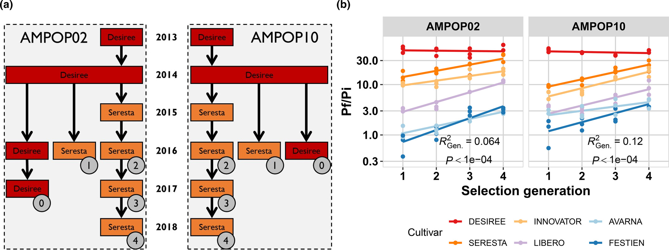
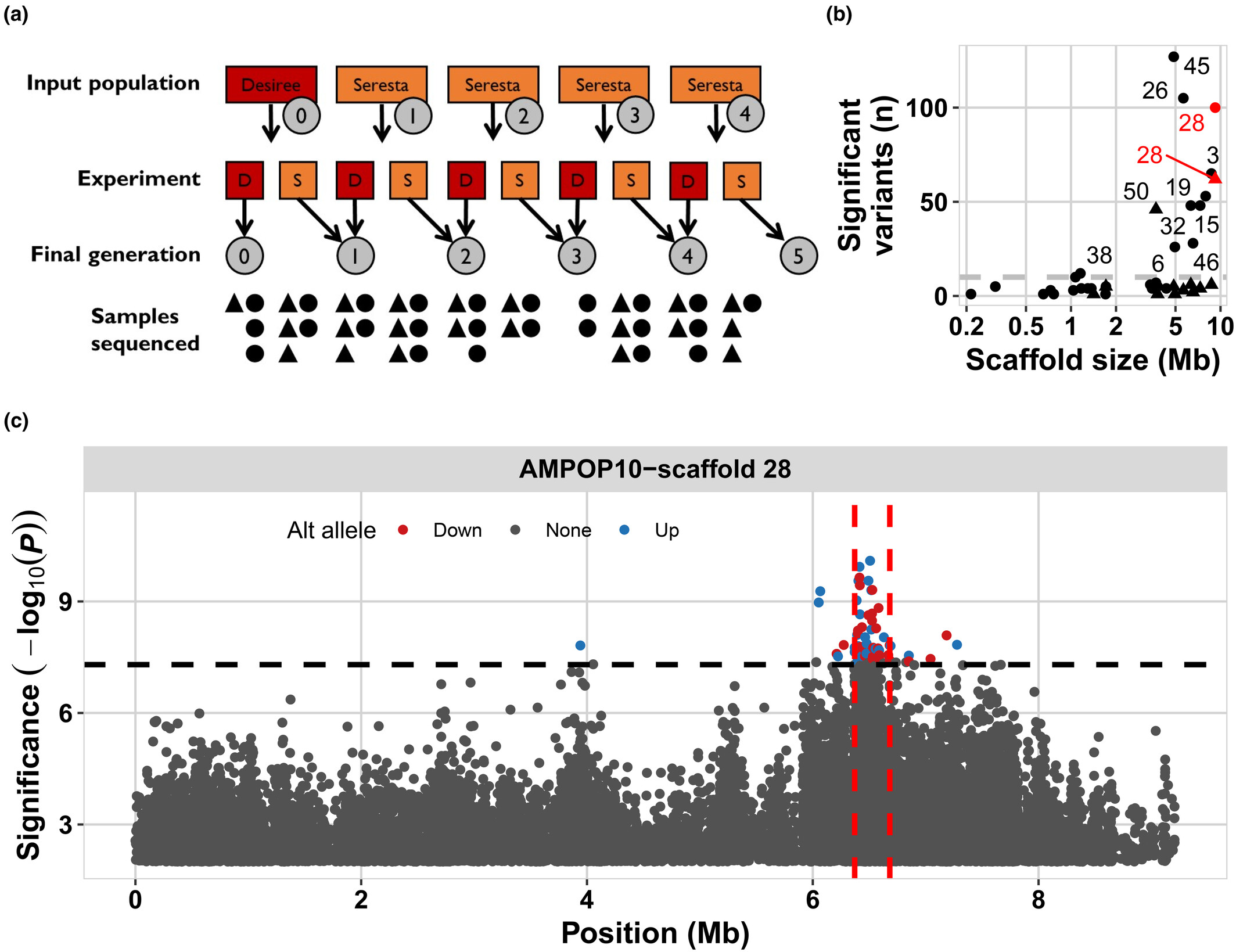
Next, we were able to identify a region on the G. pallida genome that was selected, ultimately identifying the gene Gp-pat-1. This gene is currently used as the target for a molecular assay to detect virulence in agricultural fields.
Set up your R environment
For the basics of setting up your environment, you can check Chapter 1. The Markdown file to use for the exercises and documentation of your code is here.
Loading data into R
In this tutorial, we will start with loading different types of data files into R. This is an essential skill for working with real-world data. We’ll cover a couple of file-types that are common. Each of you has their data in these formats, you can find these via the fileshare on Brightspace. If you are familiar with R, this part might be easy.
- Excel files (
.xlsx) - Comma-separated values (
.csv) - Semicolon-separated CSV files (
.csv) - Tab-delimited text files (
.txtor.tsv) (you encountered this filetype yesterday)
To make this part of the course realistic, we have provided you with data in these four formats. The reason being that this is also how it works in practice. Finding out the format of the data and loading it into memory is a crucial step in using any data-analysis pipeline.
You now need to load in data from all four data formats.
Exercise 2.1 (Loading data from an excel file (.xlsx)) To read Excel files, we use the read_excel() function from the readxl package. Excel files are very common but also very tricky. Namely, these files are mostly made by persons and people do not automatically follow conventions that are clear for a programming language. Therefore, always check the excel file before loading it in.
Exercise 2.2 (Loading data from a CSV File (Comma-separated)) CSV files are very common as format for data. Here each column is separated by a comma, rows are typically observations. We use the read.csv() function to load the data.
    # Replace with the path to your csv file
    data_csv <- read.csv("data/YOURFILENAME.csv")

    ### Check after loading
    head(data_csv)
Exercise 2.3 (Loading data from a CSV file (semicolon-separated)) Some CSV files (especially from European systems) use a semicolon (;) instead of a comma. Use read.csv2() for these files
    # Replace with the path to your csv file
    data_csv2 <- read.csv2("data/YOURFILENAME.csv")

    ### Check after loading
    head(data_csv2)
Exercise 2.4 (Loading a Tab-delimited File) These files use tabs to separate values. They often have a .txt or .tsv extension.
    # Replace with the path to your csv file
    data_tsv <- read.delim("data/YOURFILENAME.txt")

    ### Check after loading
    head(data_tsv)
2.2 Analysis of (a)virulence of Globodera pallida
This set of instructions follows the data analysis cycle, so it also includes setting up the R environment as well as loading in the data. If all is well, you already prepared this when going through the code above.
Setup R
Before we start, make sure you have set the work directory and have the following packages ready: {tidyverse} and {readxl}. Of course you also need to activate them. If you’re not sure how, check Chapter 1.
    ### type the code to install the packages

    ### type the code to activate the packages
Load data
Load your data for the tutorial into R, see the exercise above.
Inspecting data part 1
Using functions
Last time we used head(), tail(), and summarise(). Again apply these functions. But now we also want to check which piece is which. For that the functions length, ncol(), nrow(), and dim() are handy.
    # Check the first 6 rows
    head(data_csv)

    # Check the last 6 rows
    tail(data_csv)

    # get a summary of the data
    summary(data_csv)

    # get the length of a vector
    length(data_csv)

    # get the number of columns
    ncol(data_csv)

    # get the number of rows
    nrow(data_csv)

    # get the dimensions of an object
    dim(data_csv)
Exercise 2.5 (Which file is which puzzle piece?) Inspect the four files you have using dim(), nrow(), and ncol(). Which piece is which?
###Type the code to check these three properties of each file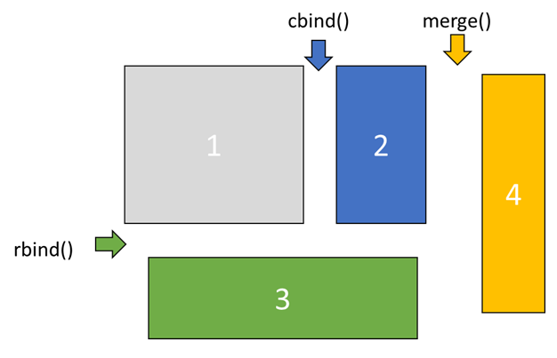
Answer the following questions (note this is random for each personal dataset!). You can deduce which piece is which via their dimensions.
Which 2 files are piece 1 and 2?
which file is piece 3?
Which file is piece 4?
Cleaning and preparing the data
Now you have the dimensions of the puzzle pieces. You can combine them in only one way.
Exercise 2.6 (Combine the data) First you need to join the two pieces (1 and 2) with the equal number of rows using cbind(). Second, you need to add the piece (3) that now has the same number of columns using rbind(). Finally, you need to add the last piece (4) of data using merge().
Complete the code below
    ### bind objects together over columns
    pheno_data <- cbind(YOURPIECE1,YOURPIECE2)

    ### binds objects together over rows
    pheno_data <- rbind(pheno_data,YOURPIECE3)

    ### merges objects, seeks for the same identitier, or you can provide it using by.x and by.y
    pheno_data <- merge(pheno_data,YOURPIECE4)
Inspecting data using histograms
After combining, it is smart to inspect the data again to check if everything went well. You can use the same functions as before or, for instance, use geom_histogram().
    ggplot2::ggplot(pheno_data,aes(x=Gpal_vir)) +
    geom_histogram()

    ggplot2::ggplot(pheno_data,aes(x=Gpal_avir)) +
    geom_histogram()
Analyzing
You now have the data complete. As you can see we have two measurements linked to one plant ID. The reason is that this data represents various inbred lines of potato plants tested for both virulent and avirulent G. pallida populations.
Normal distribution
Same as before, let’s figure out whether the data is normally distributed. For this we can use the functions stat_qq() and stat_qq_line(). Find the code to do this in Chapter 1 and check the data in the Gpal_vir and Gpal_avir columns.
    ### Add the code to make the qqplot for Gpal_vir

    ### Add the code to make the qqplot for Gpal_avir
Of course, you can also use a Shapiro-Wilk test (shapiro.test), this calculates the likelyhood whether the data follows a normal distribution.
Code
    shapiro.test(pheno_data$Gpal_vir)

    shapiro.test(pheno_data$Gpal_avir)
Exercise 2.7 (Does the data follow a normal distribution?) You now conducted two types of analyses that tell you whether the data is normally distributed. (1) what do you see in the qqplots, and what does it mean? (2) what are the p-values from the Shapiro-Wilk test? (3) what does a p-value mean?
Wilcoxon test
As the data is not exactly normally distributed, let’s deal with that in the proper way. Now we can use a Wilcoxon Rank Sum test to compare between two samples. We first need to transform the dataset, as we do not have a single observation per row currently. For this you can use the gather() function from the {tidyr} package. Use functions like head() or tail() to check what happened.
data.test <- tidyr::gather(pheno_data,key="pallida",value="juveniles",-ID,-Experiment)Now we can test how the potato plants performed against virulent versus avirulent G. pallida. Using wilcox.test()
    wilcox.test(juveniles~pallida,data=data.test)
    ###you should have a very low p-value
Exercise 2.8 (How to interpret a p-value?) You now have tested a null-hypothesis using a non-parametric test and found that the chance his data agrees with this null-hypothesis is very small. What is the biological interpretation of this p-value?
Presenting
Boxplot
Can you now also make a plot of what you just tested? Use geom_boxplot() to visualize the distribution and geom_jitter() to show the individual measurements.
    ggplot(data.test,aes(x=pallida,y=juveniles)) +
    geom_boxplot() + geom_jitter(height=0,width=0.25)
Exercise 2.9 (Boxplot with facet_grid()) There is another variable in the data as well: ‘Experiment’. Use facet_grid() to split this out. Figure out how using the ggplot2 website.
    ggplot(data.test,aes(x=pallida,y=juveniles)) +
    geom_boxplot() + geom_jitter(height=0,width=0.25) +
    facet_grid() ### add something in-between the brackets.
Fancier boxplot
Now we can add p-value as well using annotate().
    ###I'm getting the statistics here
    tmp <- tapply(data.test[,c("pallida","juveniles")],data.test$Experiment,function(x){
                                broom::tidy(wilcox.test(x$juveniles~x$pallida))})

    ### I need to include the facets
    statplot <- do.call(rbind,tmp) %>%
                mutate(Experiment=1:3,pallida=1.5,juveniles=max(data.test$juveniles),
                       label=paste("p =",signif(p.value,2)))

    ###save the plot into an object
    p1 <- ggplot(data.test,aes(x=pallida,y=juveniles)) +
          geom_boxplot() + geom_jitter(height=0,width=0.25) +
          facet_grid(~Experiment) + geom_text(aes(label=label),data=statplot)

    ###plot the plot
    p1
Exercise 2.10 (Save plot) Now save the plot, check back at Chapter 1. Use a graphical device to save the plot with dimensions of 7 (width) by 4 (height) inch.
    ### use a graphical device (e.g. pdf())
        print(p1) ### we must use print, as we have a ggplot2 object
    ### close the graphical device
Inspecting data part 2
Correlation analysis
Correlation analysis is useful to discover patterns in large sets of data or between multiple measurements on the same sample (for instance different measurements on the same plant).
As the data is not exactly normally distributed, we also have to deal with that when calculating correlation. For normal (distribution) correlation, you should use the Pearson method. This is the standard setting for cor(). For data that is not normally distributed, the Spearman method should be used. To do this, you need to specify a parameter within a fuction. If you check the function cor() using the ?, you see that you can specify method; cor(x,y,method="Spearman").
    data.test <- pheno_data

    ### Pearson correlation
    cor(data.test$Gpal_vir,data.test$Gpal_avir)

    ### Spearman correlation
    cor(data.test$Gpal_vir,data.test$Gpal_avir,method = "spearman")

    ### Test of correlation
    ### it is possible you get a warning here; this is not an error.
    cor.test(data.test$Gpal_vir,data.test$Gpal_avir,method = "spearman")
Exercise 2.11 (Correlation analysis interpretation) What do you conclude from the correlation analysis, are the two values correlated? What is the biological interpretation of this result?
Clustering analysis
Clustering is another method to explore data. Instead of patterns that move in the same direction, clustering is useful to apply if you expect consistent value differences in values.
For clustering we use the functions dist() and hclust(). The first function calculates the distance matrix, there are multiple methods to calculate the distance-matrix, here we use the standard method (“euclidean”). The second performs the clustering. This process groups the measurements that are most similar.
Because the dataset is too large to perform clustering on all the measurements, we summarise the data by taking the mean per experiment for the virulent and avirulent populations. To achieve this, we group the data per experiment using dplyr::group_by(), then we summarise using dplyr::summarise(). Then we need to transform the data to long format, for this we use tidyr::gather(). To see what happens, the code below includes a before and after inspection of the dataframe.
    ### To make the distance matrix, we first need to summarise the data
    ### otherwise the matrix becomes too large
    data.test <- dplyr::group_by(pheno_data,Experiment) %>%
                 dplyr::summarise(Gpal_vir=mean(Gpal_vir),Gpal_avir=mean(Gpal_avir))

    ###check the shape of the data before gather
    head(data.test)

    data.test <- tidyr::gather(data.test,key=population,value=reproduction,-Experiment)

    ###and after gather
    head(data.test)


    ### Here we calculate the distance matrix
    dist_mat <- dist(data.test$reproduction,diag=TRUE,upper=TRUE)

    ### to give understandable names to the distance matrix we re-write it as matrix
    dist_mat <- as.matrix(dist_mat)
        ### these two lines replace the column and row names in the matrix
        colnames(dist_mat) <- paste(data.test$population,data.test$Experiment)
        rownames(dist_mat) <- paste(data.test$population,data.test$Experiment)
    ### to conduct clustering the matrix is re-written als distance matrix
    dist_mat <- as.dist(dist_mat)

    ### here we use the base plot-function to look at the clustering
    plot(hclust(dist_mat))
Exercise 2.12 (Clustering analysis) What do you conclude from the clustering analysis, are there differences between the two G. pallida populations? What is the biological interpretation of this result?
heatmap
A handy visualization tool for correlation analysis as well as clustering analysis, is a heat map. There is a basic function in R, heatmap() that works with matrices. When you run the code below, you get a visualization of the distance matrix. The same can be done with a correlation matrix, but we do not use that today.
    ### To make the distance matrix, we first need to summarise the data
    ### otherwise the matrix becomes too large
    data.test <- dplyr::group_by(pheno_data,Experiment) %>%
                 dplyr::summarise(Gpal_vir=mean(Gpal_vir),Gpal_avir=mean(Gpal_avir)) %>%
                 tidyr::gather(key=population,value=reproduction,-Experiment)

    ### Here we calculate the distance matrix
    dist_mat <- dist(data.test$reproduction,diag=TRUE,upper=TRUE)

    ### to give understandable names to the distance matrix we re-write it as matrix
    dist_mat <- as.matrix(dist_mat)
        ### these two lines replace the column and row names in the matrix
        colnames(dist_mat) <- paste(data.test$population,data.test$Experiment)
        rownames(dist_mat) <- paste(data.test$population,data.test$Experiment)

    heatmap(dist_mat)
Exercise 2.13 (Plot of correlation) Correlation can best be visualized with a scatter plot. complete the code below to generate a scatterplot of your G. pallida data. Add the correct column name for the y-axis and the right geom to plot all data points.
Code
    data.plot <- pheno_data

    ggplot(data.plot, aes(x = Gpal_vir, y = AAA, colour=Experiment)) + ###replace the AAA with the correct column name
    geom_ +  ### add the geom to make a scatter plot
    scale_color_gradient(low="black",high="grey") + theme_bw()
Some reading
In part, this assignment was inspired by a paper in the journal Genome Biology, by Itai Yanai and Martin Lercher3. Read this paper as food for thought about what we covered today in p-value testing and its role in data analysis. This editorial paper is part of an interesting series of editorials about data science in biology: Night science4.