## To install packages from BioConductor, first install BiocManager:
if(!requireNamespace("BiocManager", quietly = TRUE)) install.packages("BiocManager")

## Install rhdf5 package from Bioconductor:
if(!requireNamespace("rhdf5", quietly = TRUE)) BiocManager::install("rhdf5")

## The rest of the packages are available via CRAN:
if(!requireNamespace("RColorBrewer", quietly = TRUE)) install.packages("RColorBrewer")
if(!requireNamespace("mapview", quietly = TRUE)) install.packages("mapview")
if(!requireNamespace("ggplot2", quietly = TRUE)) install.packages("ggplot2")
if(!requireNamespace("statgenGWAS", quietly = TRUE)) install.packages("statgenGWAS")12 Genotypic data, colour schemes and GWAS
12.1 Introduction
This chapter follows a data-driven approach: we will be working with a large genotypic dataset (SNP markers) with accompanying meta-data, and a linked phenotypic dataset of flowering time in A. thaliana. You will gain some experience with data subsetting, data curation and visualisation, with some focus on the choice of colour schemes. Familiar techniques like PCA will be used (already covered in week 3), followed by some possibly less familiar techniques (genome-wide association study). As we will be using data from a previously-published study, part of today’s exercises will try to replicate some of the figures from the publication itself.
12.2 Install R packages (dependencies)
We will be using a number of packages that should ideally be installed at this stage so that any installation issues can be handled together.
For reading HDF5 files, there are some packages available via CRAN, but the rhdf5 package from Bioconductor seems to work well (we first install the BiocManager package to handle the rhdf5 installation).
Note that in all of the following calls, we first check whether the package has already been installed on our computer (!requireNamespace() returns TRUEor FALSE depending on whether the package is already installed or not).
12.3 Downloading Data
All the data that we will be using today is publicly available and free to download, and is connected to the 2016 Cell paper “1,135 genomes reveal the global pattern of polymorphism in Arabidopsis thaliana”1. The genotype data in particular is quite large (> 900 Mb), most of which we won’t use. If storage space is an issue for you, you can also work with the subset(s) of the genotype files that we will be generating.
Genotypes
You can download the SNP genotype data from the 1001genomes.org website via the following link: https://1001genomes.org/data/GMI-MPI/releases/v3.1/SNP_matrix_imputed_hdf5/
The large tarball (1001_SNP_MATRIX.tar.gz) is the relevant directory to download. You will need to extract this compressed folder to access the ‘imputed_snps_binary.hdf5’ file that we will be using. These will be made available via Brightspace in the coming hour.
Accessions list
The list of accessions associated with the SNP data is on the same website:
https://1001genomes.org/accessions.html
Scroll down to the bottom of the ‘1135 Accessions Final Set’ tab and click on “Download complete list (CSV)”
Phenotypes
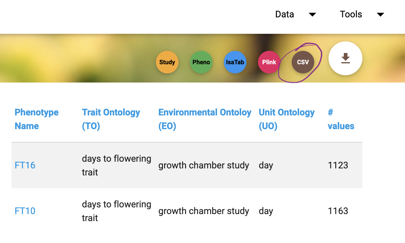
The flowering time phenotypes for this Arabidopsis panel that we will be working with are available here:
https://arapheno.1001genomes.org/study/12/
Download both the FT10 and FT16 datasets; this can be done in one step using the download button above the table (and select the CSV option):
12.4 Data overview
As usual, it’s convenient to make a new folder where all datasets has been saved, and set your working directory to that folder using setwd().
- First, check out the structure of the SNP data using the
h5ls()function:
rhdf5::h5ls("imputed_snps_binary.hdf5")So there are 10,709,949 SNPs scored per accession, which is more than we can easily handle. We can read in the SNP positions and the accession names using the h5read() function:
accessions <- rhdf5::h5read("imputed_snps_binary.hdf5","accessions")
positions <- rhdf5::h5read("imputed_snps_binary.hdf5","positions")
12.5 Big data in R
R is not famed for its capacities to deal with big data. In R, “big” usually means taking up lots of working memory. For example, if we try to allocate a very large vector within R, at some point we will get an error message (on my computer this occurs for i = 10 in the following call):
for(i in 1:10){
  t <- system.time(temp <- rep("memorytest",10^i))
  message(paste0("A vector with 10^",i," elements takes ",round(t[3],1)," seconds to generate and store."))
  cat("____________________________________________________________________\n")
}
In today’s example, we will be looking at the effect of different subsetting / data simplification strategies on the results we obtain (mainly in terms of population genetics).
12.6 Subsetting the SNP data
To handle this “big-dataset” and generate results quickly, we are going to use a subset of the SNP data today, sampling 10k SNPs from the total set to work with.
For consistency between our results, let’s set a random number generator seed e.g. 1234:
set.seed(1234)This ensures that our results will be identical (i.e. the results generated here are reproducible).
Our first approach is to randomly sample() ten thousand SNPs.
Save this (pseudo-random) selection in an object called snp_index, using something like the following code (completed of course!):
nSNP <- 1e4 #target total number of SNPs.
snp_index <- NA #you need to replace this with R code that samples 1e4 SNPs!
We are going to read in these positions using the same function as before. Out of interest, try to time this step on your computer, by wrapping the code with the system.time() function:
system.time(SNP <- rhdf5::h5read("imputed_snps_binary.hdf5","snps",
index = list(NULL, snp_index))) - Give meaningful row and column names to
SNPand save it as an .RDS file using thesaveRDS()function.
We are going to repeat this procedure, but instead of randomly taking 10k separate SNP positions, we are going to sample 10K SNPs in chunks instead, with these chunks evenly spaced over the whole genome. We will subsequently be comparing the results between using the original random set of SNPs, or having the same number of SNPs, but sampled in non-random chunks.
Exercise 12.1 (Subsetting data)
Try to generate these alternative subsets yourself, while noting how much time it takes to read in 10K SNPs when they are read in chunks rather than singly.
Also make a version of the random 10K SNPs with a Minor Allele Frequency of at least 0.05 (minor allele frequency refers to the frequency of the less common allele at a locus, in the range from 0 to 1). Hint: check that the SNP allele frequency
>= 0.05. How many SNPs remain after filtering?
If you are unable to complete these steps yourself (after a reasonable attempt), you can check Brightspace for code to complete exercise 1. If it is not yet visible, please raise your hand.
12.7 Accession data
We have also downloaded information on the accessions in comma-separated format. Supposing you have saved them in a file called “metadata.txt”, we can read in this data as follows:
meta <- read.table("metadata.txt", header = FALSE, sep = ",")
head(meta)
We need to provide column names, using information from the website (as these were not included in the downloadable data).
Three of these columns are ambiguous:
colnames(meta) <- c("ID","seq_by","name","country",
                    "name_abbrev","lat","long","collector",
"dunno1","CS_num","admixture_group","dunno2","dunno3")- Check that the IDs listed here are in the same order as the accession numbers from the SNP data.
Hint: use == and wrap the result using the all() function.
We check what the 3 unknown columns are using table(), and save the meta data:
table(meta$dunno1)[1:10] #listing the first 10 only; collection dates presumably
table(meta$dunno2) # name this column Y, not sure what it stands for
table(meta$dunno3) # Perhaps something to do with the colours used for admixture groups?

table(meta$dunno3, meta$admixture_group)

## Fill in the missing 3 column names:
colnames(meta) <- c("ID","seq_by","name","country","name_abbrev",
                    "lat","long","collector","date","CS_num",
                    "admixture_group","Y","circle_col")
head(meta) #looks OK
saveRDS(meta, file = "meta.RDS")
Out of interest, do you recognise any of the collectors?
table(meta$collector)Exercise 12.2 (Extra question)
- Which accession carries the reference allele at all sites?
12.8 PCA
A Principal Component Analysis is a useful way to visualise variation in a dataset. When applied to genomic data like the SNP genotype matrix, it can give insights into the genetic similarity between individuals in the population, i.e. the structure of the population being studied.
Apart from running the PCA and interpreting the results, we would also like to check whether there are differences between our results depending on how we subsetted / filtered the data, as well as checking how the PCA results align with the admixture analysis performed by the authors of the 2016 Cell paper.
You should have four different genotype datasets:
the original random 10K SNPs
10K SNPs in 200 chunks
10K SNPs in 1000 chunks
the original random 10K that was filtered on MAF
We read them in here again so that we are working with standard object names (you may have saved the objects under different filenames; please adjust as necessary):
SNP <- readRDS("SNP.RDS")
SNP2 <- readRDS("SNP_200regions.RDS")
SNP3 <- readRDS("SNP_1000regions.RDS")
SNP_maf <- readRDS("SNP_maf.RDS")
If you were unable to produce these yourself (even with the previous script provided, e.g. you could not download the original data) then please check Brightspace for the files. Can’t find them? Maybe they have not yet been made visible - if so, please raise your hand!
Do you expect that our method of subsetting 10k SNPs will have a large effect on the PCA results?
What about the filtering step for Minor Allele Frequency, do you expect that should have any effect?
Before running the analysis, think about these points and discuss with your neighbour(s).
We will be using the prcomp() function available in base R, which is relatively simple to use, but does not automatically scale the input data before running the PCA (i.e. the default is that scale = FALSE). In almost all cases it is advisable to scale (if you have a variable that is constant then scaling will be problematic (division by 0), but a constant variable doesn’t tell us much anyway and should probably have been removed beforehand..)
Bring up the documentation using ?prcomp for more details of the function:
?stats::prcompYou can briefly read through this if interested, but first let’s start with the random 10K set, using prcomp() to run the PCA:
fit <- prcomp(SNP, scale. = TRUE)This may take some time to run, depending on how fast your computer is. You can use this time to further read the function documentation. If prcomp() is taking inordinately long (more than 2 minutes say), something might be wrong - please raise your hand!
Once we have run the PCA analysis, we would like to visualise the results.
Here is a small script to take the output of the prcomp() function and plot it:
pca_plot <- function(fit, # output of prcomp()
                     x = 1, # which component to plot on the x axis
                     y = 2, # which component to plot on the y axis
                     screeplot = FALSE, # option to additionally plot a scree plot
                     addpoints = TRUE, # if FALSE, only the axes will be plotted
                     ...){ # additional arguments passed to plot() or points()

  if(screeplot){
    screecols <- rep("grey",10)
    screecols[c(x,y)] <- "green"
    plot(fit, col = screecols)
  }

  scores <- fit$x[,c(x, y)]

  ## Extract the explained variances:
  ve_x <- fit$sdev[x]^2/sum(fit$sdev^2)
  ve_y <- fit$sdev[y]^2/sum(fit$sdev^2)

  plot(NULL,
       xlim = c(min(scores[,1]), max(scores[,1])),
       ylim = c(min(scores[,2]), max(scores[,2])),
       xlab = paste0('PC', x, ' (', round(ve_x*100, 1), '%)'),
       ylab = paste0('PC', y, ' (', round(ve_y*100, 1), '%)'),
       ...)

  if(addpoints) points(x = scores[,1], y = scores[,2], ...)
}
Feel free to adapt or improve this function as you like.
NoteAside: Passing arguments using
...
You may have noticed that we used an ellipsis (...) as an argument of the function pca_plot(). This allows us to pass extra arguments to plot() in our function call to pca_plot(). So for example, if we want to add the plot title ‘PCA’ we would normally add main = "PCA" as an extra argument to plot(). We can still do this in our new function.
You may also have observed that the ... was passed to the points() function as well. This is somewhat bad / sloppy programming practice, as we may not want to pass certain arguments to either plot() or points(). For example, main is not an argument of points(), but we have not told R where we wanted main to be passed on to. But thankfully in this example, both plot() and points() are quite forgiving of being passed spurious (named) arguments, as they are closely-related functions. Other functions may not be so forgiving and will probably give warnings if you did this! If you want to test this, try running the following code line by line, and seeing what happens:
plot(1:10)
points(1:10, main = "test") #main is not an argument of points...
points(1:10, test = "test") #test is not an argument either!
If we wanted / needed to be more careful, we could extract all the extra arguments by checking against the named arguments of pca_plot(), storing these as a list, and then check to which internal function they should be passed (by checking names). In situations where two or more sub-functions both use the same argument names, we would then have to decide what we would like the function to do (pass to both sub-functions, or define sub-function specific ellipses..). But for our purposes here, we will ignore all these concerns.
One final note of interest - in pca_plot(), we have already specified some arguments, for example the x and y axis labels, and the x and y axis limits. If we try to override these, we will get an error. Try this for yourself, and see if you understand what the Error message means.
Exercise 12.3 (PCA plots)
- Plot the output of the PCA analysis on the random 10k SNPs, giving an appropriate plot title.
- Make a second plot of PC1 versus PC3. Do you notice any outliers? Can you identify in which country this accession was collected?
- Repeat this exercise by also looking at PC1 versus PC4, and identifying the origin of the outlier.
These steps may take a little while to complete. A small R script to do this will be made visible on Brightspace (after you have tried to do this yourself first). If it is not yet visible, please raise your hand.
12.9 Choosing colour palettes
One important topic when working with data is how best to visualise the results of some analysis (or the raw data itself), particularly if this is to be shared with a broader audience. Colour is one way to denote differences in such visualisations (alternatives are symbol shapes, symbol sizes, line types, line weights etc.). There are many resources available to choose appropriate colour sets or palettes, and we will be using a few of them today.
Data types
If you start searching for information on colour palettes and data visualisation, you will probably see that three basic types of data are generally recognised:
Sequential - where ordering from low to high is possible
Diverging - data with two extremes and a meaningful midpoint (like 0)
Qualitative - i.e. categorical data
For each of these types of data, different colour palettes are available. You may already have some experience with these types of colour palettes if you have ever used ‘Conditional Formatting’ in Excel.
When choosing a colour palette, there are a number of important considerations:
What is the data type?
How many categories are present (for categorical data)?
Is the choice of colours distinct and colour-blind friendly?
For the last of these points, quite some effort has been made to develop colours that can still be distinguished by people with various forms of colour blindness. At the start of this session, we already installed a colour package, namely RColorBrewer. This is one of the most popular colour palette generators, and has a nice website that can also be used for inspiration and exploration (colorbrewer2.org). To look at all the palettes available in the package, use the display.brewer.all() function:
par(mar = c(1,4,1,1)) #decrease the whitespace padding / margins
RColorBrewer::display.brewer.all()
Admixture results
Now that you have some experience with running a PCA, let’s investigate how well the PCA results align with the admixture assignments from the original 2016 Cell analysis. We will be using Set1 from the RColorBrewer package, which corresponds closely to the colour palette used in the 2016 Cell paper for the admixure groups.
Exercise 12.4 (Colour palette)
First, check how many admixture groups are in the data. Also check how many colours are provided by the RColorBrewer ‘Set1’ palette.
Amend the ‘Set1’ palette as needed, to create a named colour vector with the same colours in the same order as was used in the Cell 2016 paper (e.g. Relicts should be red, Admixed should be black etc.)
To visualise the PCA results and colour by admixture group, we will be using a follow-on function that calls on pca_plot():
admix_pca <- function(pcafit,
                      cols,
                      metadata = meta,
                      ... #arguments passed through to plot()
){
  pca_plot(fit = pcafit,
           addpoints = FALSE,
           ...)

  points(pcafit$x[,1], pcafit$x[,2],
         col = cols[metadata$admixture_group],
         pch = 19)

  ## position of the legend is hard-programmed here, not ideal..
  legend("topright", pch = 19,
         col = cols, legend = names(cols),
         cex = 0.7, bty = "n")
}
Exercise 12.5 (PCA plots)
- Using the function we have just defined, produce a PCA plot from a PCA fit for each of the 4 genotype datasets. Use the colour palette that you developed, making sure the order is consistent with the publication. Can you identify (some of) the admixture groups easily in the PCA plot?
Are the PCA results consistent among themselves, i.e. across the four datasets? If not, why?
12.10 Visualising geo-reference data
One of the nice extra features of this dataset is the inclusion of latitute and longitude information for each of the accessions. We will be using the R package mapview to visualise the data, to see where the accessions were originally collected, and colour these by e.g. the admixture group or (out of interest) the sequence provided (who did the sequencing or genotyping work).
You should already have installed the mapview package; load the package and test it using a sample dataset provided with the package:
library(mapview)

mapView(breweries)
First, try to map the latitude and longitude columns from the meta data. We will use the argument crs = 4326 to specify that the co-ordinates are using the standard geo-referencing system (an assumption!). We also turn off the grid using grid = FALSE. Note that the column names for longitude and latitude are long and lat:
mapView(x = meta,
        xcol = "long", ycol = "lat",
        crs = 4326, grid = FALSE)
Unfortunately, the mapview::mapView function is not able to handle missing values!
Exercise 12.6 (mapview plot)
Make a copy of the meta dataset without missing values for the GPS co-ordinates. Use the
mapview::mapViewfunction to visualise the accessions, using default colour settings (using function call above).If this is (still) not working, try to figure out what is going wrong. For example, Google your Error message to try to solve the issue.
As you can see, there may still be some unexpected issues that come up when trying to use this package (although these may also have been solved by a package update by the time you attempt this exercise). If you are still stuck here after a decent attempt at trying to solve the issue yourself, you can use the R code available via Brightspace. If it is not yet visible, please raise your hand.
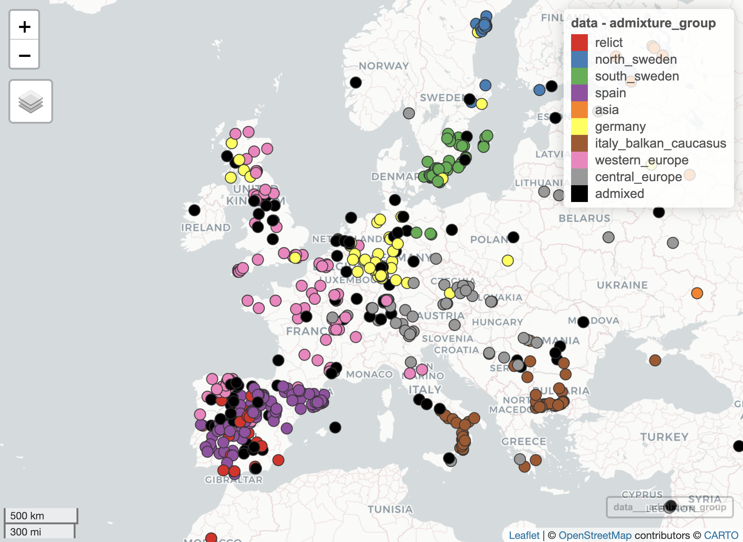
Exercise 12.7 (mapview plot)
- Re-plot the geographic distribution of accessions using the
mapview::mapView()function, colouring the points by admixture group using the same colour palette as before (i.e. consistent with the publication). Adjust the settings so that the points are fully opaque.
Your resulting plot should look something like the following:
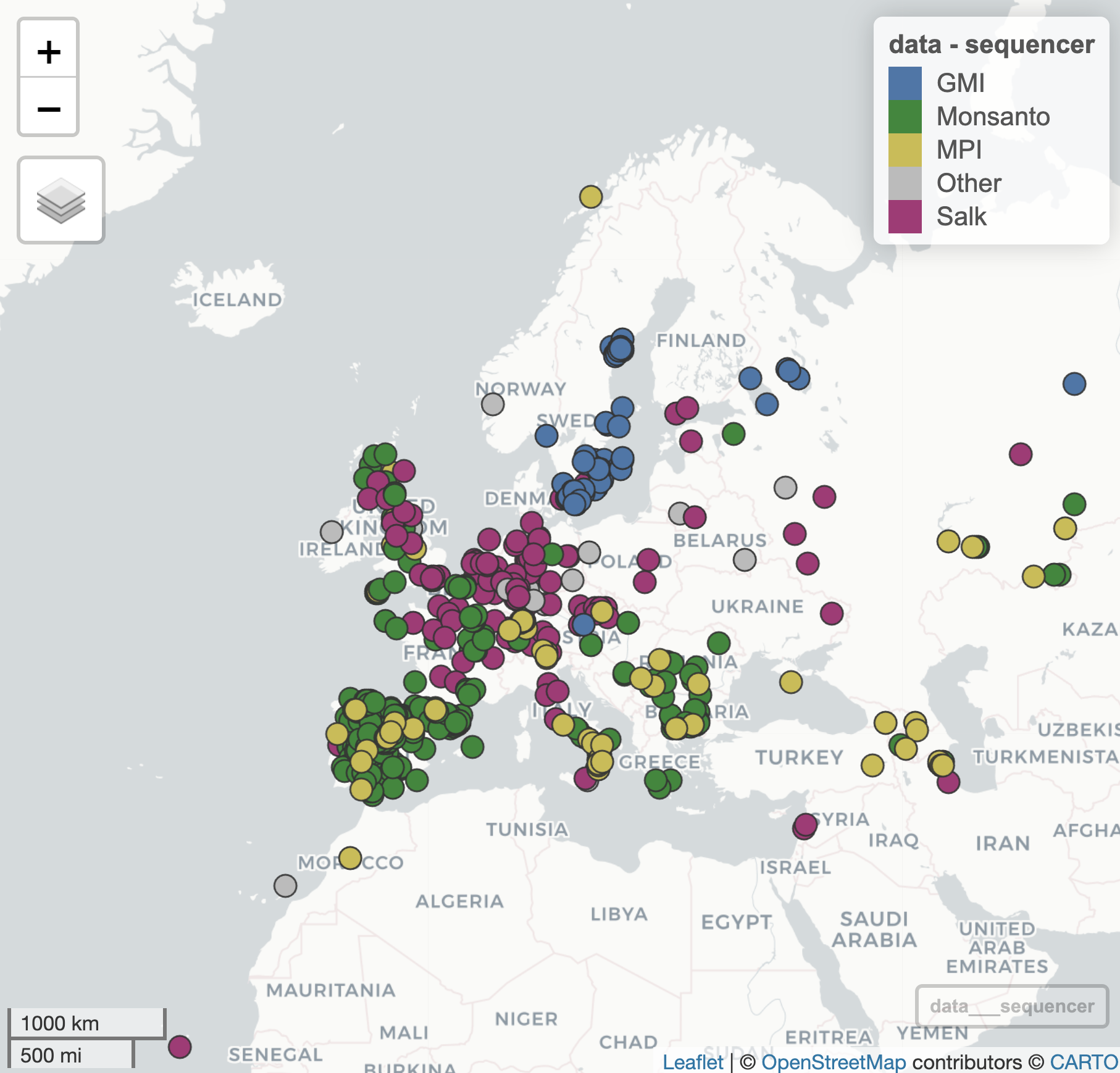
To get some more practice on data manipulation and plotting, we now turn to the sequence provider column. As you will see, there are many different sequence providers, but we are only interested in looking at the distribution of providers that genotyped at least 100 accessions. Everything else can be included in an extra category “Other”.
Regarding colours to use, you are asked to use the “Bright” qualitative palette developed by Paul Tol (sronpersonalpages.nl/~pault/), namely the colours blue (4477AA), green (228833), yellow (CCBB44), purple (AA3377) and grey (BBBBBB).
Exercise 12.8 (Sequence providers)
How many sequence providers appear more than 100 times in the dataset? What are their names?
Create a new column in your dataset for sequence provider, in which all providers that appear less than 100 times are combined into a single category “Other”
Using the (subsetted) ‘Bright’ palette in which the “Other” group is coloured grey, make a
mapview::mapView()plot of the Arabidopsis accessions coloured by sequence provider.
Your plot should look as follows:
12.11 Reproducibility of results
It is often important to be able to reproduce results from previous research. The usual meaning here is that a new / independent experiment or study is performed, confirming (or not) the previous findings. However, at its very least reproducibility should hold true within a dataset, ie. another researcher that tries to re-run your analysis with your data should be able to generate the same outcomes. In many cases a workflow or script is provided as part of a publication so that the results can be easily generated.
In the following two exercises you are asked to reproduce two of the figures from the 2016 Cell paper.
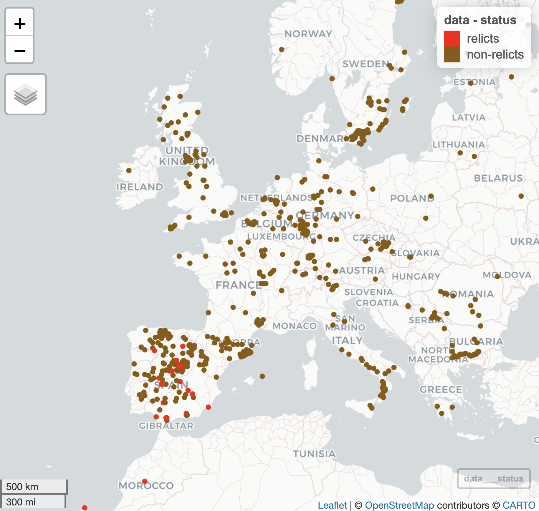
Graphical Abstract
The first figure we will try to re-create is relatively straightforward, relying on the mapview::mapView() function as before but this time only distinguishing relicts from non-relicts:
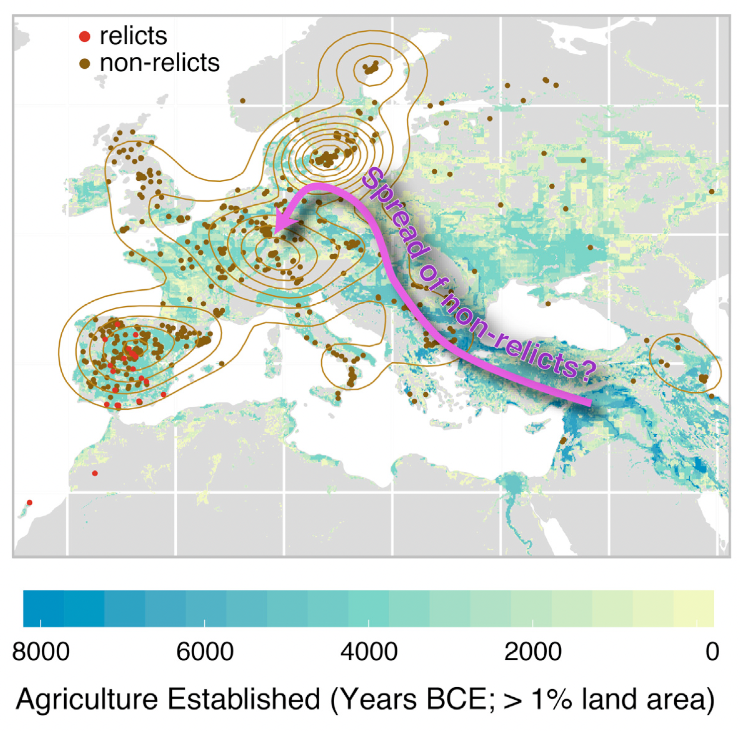
The authors probably used Adobe Illustrator or Powerpoint (or perhaps Coral draw etc etc.) to overlay the pink arrow showing the possible spread of non-relicts back into continental Europe following the retreat of the glaciers at the end of the last Ice Age. We are not interested in overlaying this arrow and text, but we would like to create the underlying plot that distinguishes between relicts and non-relicts only.
Exercise 12.9 (mapview relicts)
Add a new column to your dataset that distinguishes samples as either “relicts” or “non-relicts”
Using the
mapview::mapView()function, generate a plot that shows the geographical distribution of ‘relicts’ and ‘non-relicts’ in red and brown, respectively. Ensure that ‘relicts’ are listed first in the legend.Change any other plot attributes to get as close to the original plot as possible.
The resulting plot should look something like this:
Supplementary Figure S5
As a follow-up exercise, you are now asked to reproduce (part of) a supplementary figure of the 2016 Cell paper (Figure S5), showing the distribution of Variants by Type and Group:
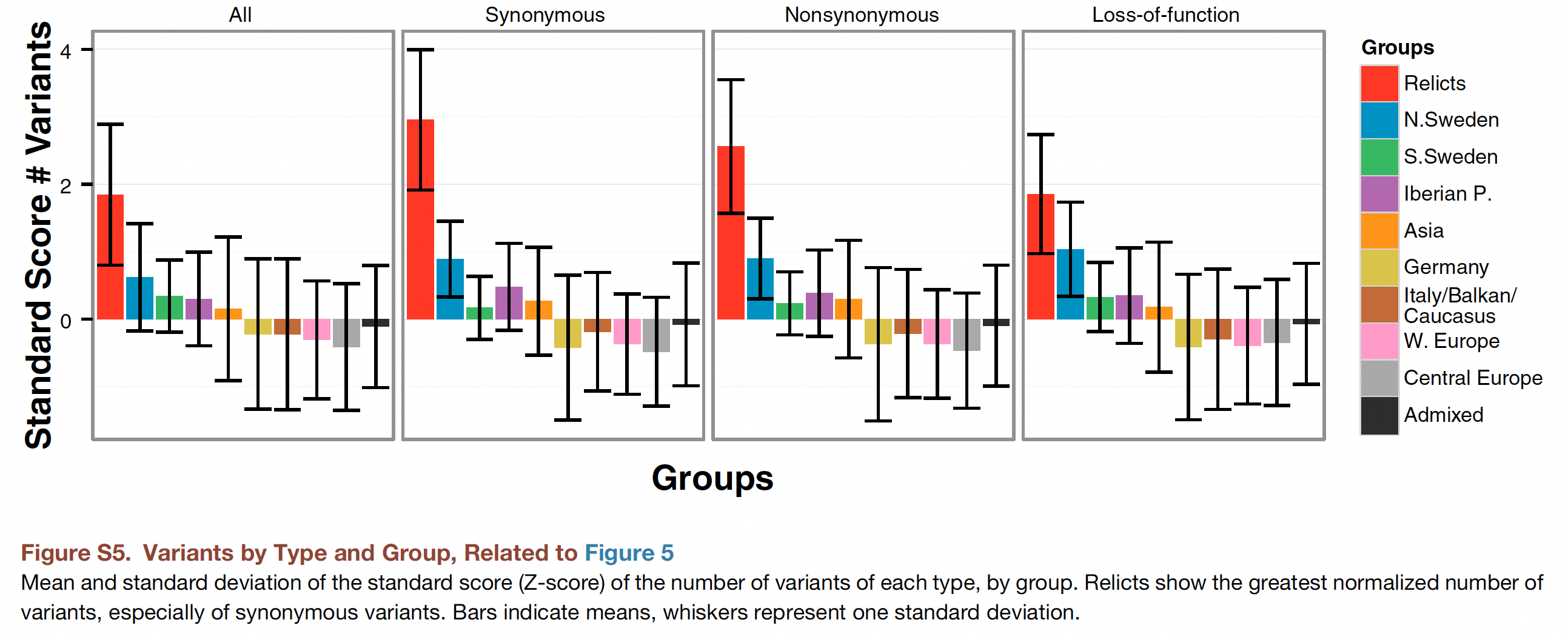
To keep things simple, we will only reproduce the first panel (the bar chart on the left) where we do not make any distinction between synonymous, non-synonymous or loss-of-function variants (it is not obvious how we could categorise SNPs in this way without having extra information on the flanking sequence of the SNP, from which we could determine whether it is in a coding area of a gene and whether the base-pair change would lead to any differences in the protein when transcribed).
As you can see from the figure caption, the plot shows the mean and standard deviation of the standard score (Z-score) of the number of variants by group. Whiskers represent one standard deviation.
- Can you recall what a Z-score is, how it is calculated, and why they are useful?
Exercise 12.10 (Reproduce Figure S5)
Using the random 10K SNPs, first calculate the number of variants (i.e. SNP alternative allele counts) per accession.
Convert these counts into standard (Z) scores using the
scale()function.Summarise these Z-scores per admixture group, calculating both the
mean()andsd()Z-score of each group.Using
barplot()(or if you prefer,ggplot2::geom_bar()), generate a bar chart showing the means. Order the barplot in descending order (so, the admixture group with most SNPs appears first etc.). Colour the bars using the same colours as before (consistent with the publication figure).Add the standard deviations per group as error bars, and finally, add a legend.
If you were able to perform all these steps, you should have produced a plot looking something like this:
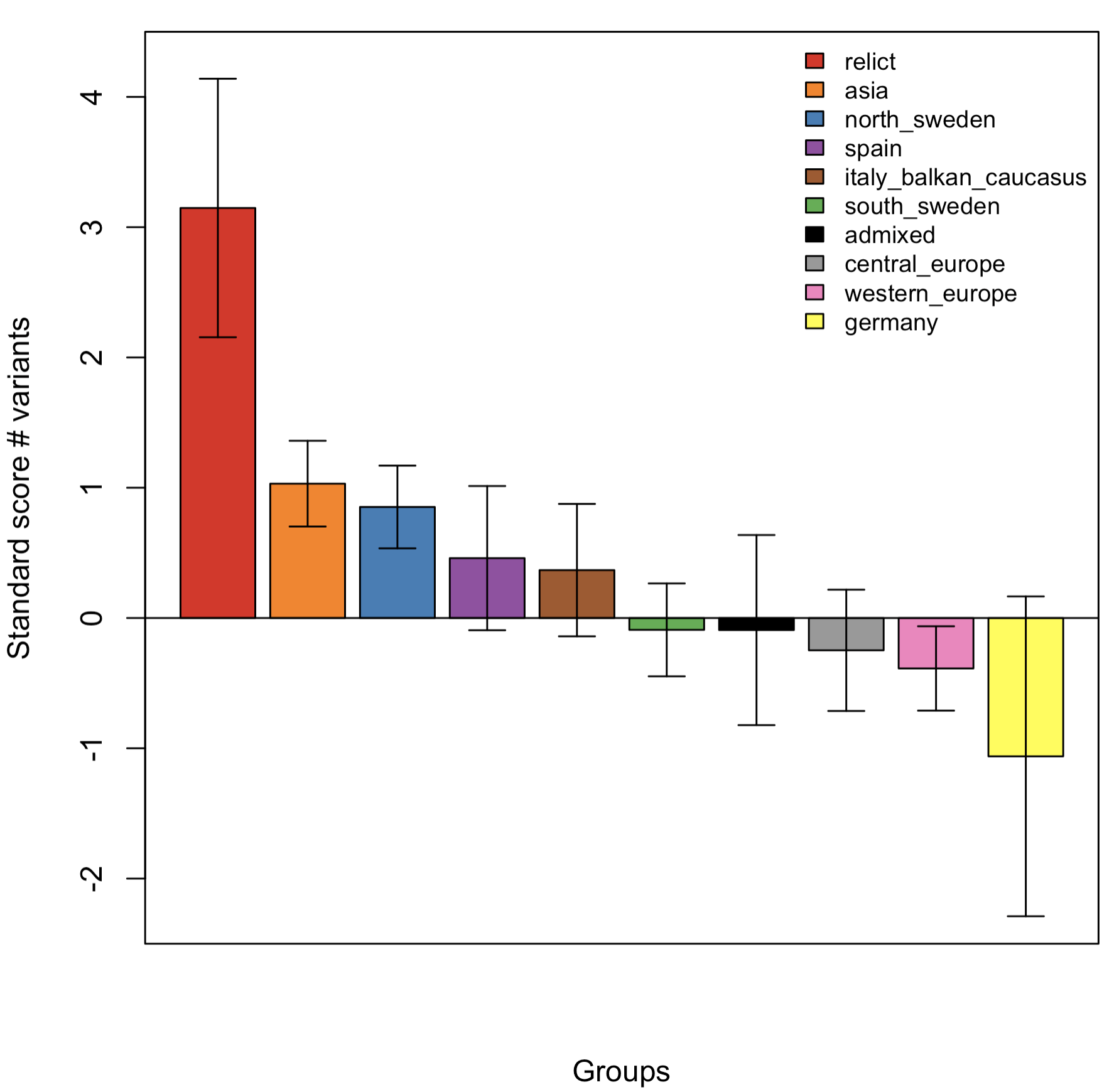
Although not exactly reproducing Figure S5, the trend shown is broadly similar (this was using data from 10K rather than 10M SNPs).
12.12 Phenotypic diversity
We leave the SNP data for now to have a look at the phenotype dataset we downloaded earlier (on my computer this is a CSV file called ‘values.csv’):
pheno <- read.csv('values.csv', header = TRUE)Exercise 12.11 (FT trait comparison)
What is the (Pearson) correlation coefficient between the two traits (FT10 and FT16)?
Make a suitable visualisation to compare values of FT10 versus FT16 across the population (ideally a scatter plot). Are there any visible outliers?
One of the accessions has quite a high FT10 value (greater than 150 days). What is the name of the accession and where was it collected?
We are going to once more visualise the geographic distribution of accessions, but this time coloured by flowering time.
Before proceeding, reflect on what sort of data flowering time is? (i.e. is it Sequential, Diverging, or Qualitative)?
Have a look again at the website of Paul Tol. A tweaked version of the YlOrBr scheme is suggested; choose this or another suitable colour scheme that is mentioned.
If you downloaded the flowering time data in a single file, you only have the phenotypic data and the accession IDs available (as well as a replicate ID that we do not use):
head(pheno)In order to combine the phenotypic data with the geographic co-ordinates, we need to merge() the two datasets. Have a look at the help menu for the function and see whether you can create a merged dataset yourself.
Exercise 12.12 (mapview FT)
- Using an appropriate colour palette, produce a visual display of the geographic distribution of Arabidopsis accessions coloured by flowering time (either FT10 or FT16), again using
mapview::mapView().
Hint: use the argument zcol to specify the column name you would like to use to define the colours on the points, and col.regions argument to supply the colour palette.
Reflect on what you see - is there an association between flowering time and geographic distribution? What explanatory variables might you include in the model? What would the response variable be?
As an additional exercise, fit a model that tries to predict FT16 from geographic location. Is this a good model? Why / why not? Could you suggest any improvements?
12.13 Genome-wide Association Study (GWAS)
A GWAS is a well-established method to uncover genetic variation that underlies phenotypic variation. Although originally applied to human genetics studies, it has also had a big impact on the identification of important genetic variants in both plant and animal populations.
Although there are quite a number of different methodologies to perform GWAS, they all share similar elements:
a statistical model to relate genetic variation at a locus with phenotypic variation,
a method to control for differences in relatedness between samples,
a method for declaring that an association is “significant”, in particular controlling for false-positive associations due to multiple testing.
One of the most common GWAS models applied to plant and animal populations is the linear mixed model with kinship correction2. We will be using this model as implemented in the statgenGWAS package3 to look for significant SNPs underlying variation in flowering time in Arabidopsis.
Although the genetics underlying flowering time are of course of interest, we are also interested here in arranging the data we have been working with to be able to run the GWAS. In many cases with more advanced analytical methods that have been implemented into software packages, half the work can be in organising and transforming your input files to the expected format that the package requires. Hence, the emphasis here is on practicing the manipulation of a dataset into a suitable format.
Package manual / vignette
There are a number of manuals available for the statgenGWAS package, either the very concise package overview which gives a short overview of what is possible, or the more complete package vignette which explains more of the theory as well as more extensive worked examples. If you read the documentation, you will see that the central object used in the package is an object of class gData. There is a function statgenGWAS::createGData() to create a gData object, with a number of arguments. In our case, we will be supplying SNP data via the argument geno, marker positions via map and the phenotypes via the argument pheno.
For the purposes of this exercise, we will use the 10K randomly-selected SNPs for our genotypic data. If you recall, you (should have) given meaningful row and column names to your SNP dataset. Let’s double-check this:
SNP <- readRDS("SNP.RDS")

## Have a look at the first 10 columns (and 6 rows):
head(SNP[,1:10])
As we can see, the rownames are the accession IDs, and the column names are bp positions.
Exercise 12.13 (Prepare GWAS data)
Run
?createGDataand read the Arguments section. In what format shouldmapbe in?Make a suitable map object for the markers contained in
SNPto pass to themapargument in thestatgenGWAS::createGData()function.Make any other changes as needed to adapt the objects passed to the function arguments
genoandpheno, and then create thegDataobject by running the functionstatgenGWAS::createGData().
Once you have completed these steps, you can remove duplicate markers using the statgenGWAS::codeMarkers() function. You are now in a position to run a single trait GWAS model.
Exercise 12.14 (Run GWAS)
Use the
statgenGWAS::runSingleTraitGwas()function to perform a GWAS analysis using the SNP data for the traits ‘FT10’ and ‘FT16’.Have a look at the
summary()of the output. Did you detect any significant QTL for either of the traits? On which chromosome(s)?Generate QQ-plots and Manhattan plots for both analyses.
If time permits, try using a more advanced approach by correcting for kinship chromosome-by-chromosome, as described in the vignette. Does this result in any more QTL being detected? What about (possible) p-value inflation?